Escaping to cottage country


 Aubrey and I escaped to the cottage for a day this week. Sometimes you just need to escape. My brain is swirling with work, and getting the Holiday 2011 collection designed (yes, I have to start this early) So a trip to the cottage was in order. There is something about driving through the countryside that calms me. (Above is a photo from the road that winds down to our cottage)

In my last post I showed you our finds from Coboconk (which is where my cottage is). A new antique shop opened up and we popped in. Although they weren't actually *open* as she was setting up for the long weekend, but let us in .... and was probably glad she did because we bought a LOT.

Table of wooden boxes starting ar $4
The table of wooden boxes, around $4 to $6.

I fell for this oil painting but it was a bit wavy and I didn't know where I'd put her. But I loved her. And she was $65

Vintage rolling pins, $8 each

The owners told me stories of finding treasures in the dump ... yes, the dump. And they invited me to go and check it out for myself. At the thought of finding awesome treasures, I kindly told them I'd be more than happy to let them do the searching and I'd just pay them for their efforts! But can you believe that people throw out amazing things? Honestly, donate it. Don't throw it out. :(

Some treasures


Aubrey, Oscar and I did some adventuring this week that included some out of town treasure hunting.  This little antique store in Coboconk, Ontario had a table full of the coolest wooden boxes at drool worthy prices (I bought almost all of them). I thought they would make some lovely gifts for a few people I know. Among a number of other things, I also picked up an old rolling pin that had the prettiest blue handle. 
Pssst. My little shop is having a Buy 1, Get 1 Free Sale to celebrate Canada Post going back to work. ;)

Abstract Design

Abstract self expressionism strikes again!  There is just something spontaneously sporadic about this design that is compels you to look and question the designer’s rationale! 
Is this a modern masterpiece, a Picasso inspired design, or is this a blatant attempt to be different that hasn’t really worked? 
Whatever decision you come to it must be said that the tall wall units to the left of the image seem isolated and strange, temporarily causing the eye to drift from the main body of the design.
But maybe that’s abstract!?

The Elephant and the Daisy!


Okay there is allowing the kitchen to be absorbed into the surrounding architecture and there is losing the opportunity to actually have a kitchen!  This idea is forward thinking but it could be seen as a little naive! 
The idea of the kitchen transformer is one that has been explored by lots of designers in many different ways but this particular creation lacks soul.  The Mogul can appreciate how this design could be considered to be a piece of contemporary art but feels it might be stretching it a little to actually describe this design as a commercially viable kitchen. 
Seeing the outline of the kitchen on the wall would eventually irritate The Mogul....if the kitchen is going to disappear into the wall it would be nice not to have such a strong reminder of its presence.  The Mogul would even argue that having an island in the centre of the room with transforming elements and subtle lighting may be less obvious than this kitchen, which while in the standby position gives away its position like an elephant hiding behind a daisy!
There is also the little issue of creating the architectural void into which the kitchen will slide!
It is great to see individual designers trying to come up with new ways of expressing kitchen design and although The Mogul has voiced an opinion, concepts can be fine tuned and become revolutionary.

Insignificant Kitchen Design


Notice how the kitchen is absorbed into its surroundings as the stronger colours and textures in the foreground dominate the field of vision.  The white kitchen sits humbly in the background, almost insignificant, but providing great aesthetical contrast and balance.
In an open plan space like this it is vital to consider what impact the kitchen will have whilst sitting in the “standby” position. 
Great renders – we are entering a virtual World...or is the KBB industry already there?

Designer Kitchen


It was only going to be a matter of time until The Mogul decided to comment on one of Philippe Starck’s creations for Warendorf.  The Mogul’s initial reaction was to dismiss the range as a grotesque celebration of ego, an example of the industry bowing to the power of one individual, and embracing the control of a celebrity designer.  And yes, this range is guilty of putting Starck on a pedestal, enabling him to loom over other less celebrated designers who create change and industry drive on a daily basis, and are using more humble budgets to do so. 
But you do have to appreciate Starck’s skill as a designer.  There is real depth to this design and he is obviously a keen observer of the industry, either that or he is able to take advice well!  His range could be described as a selection of “unfitted kitchen pods with a flamboyant sprinkling of eccentric”!  Aesthetically there is a drive to be unusual, a blatant effort to be “designer”; and this element of the concept certainly ticks all the right boxes for many. 
The exclusive looking trumpet legs work brilliantly adding design flair and hiding the island services in a dignified way.  The appliances can be hidden behind doors, aesthetically neutering the functionality of the kitchen and allowing it to become the centre piece of any home.  Special motors have even been included that dissipate residual heat from the ovens so that the door can be closed immediately after use. 
One thing The Mogul is unsure about though is what happens to the tall “oven modesty” door whilst the ovens are actually being used, does it protrude into the room causing an obstruction or does it neatly slide into a pocket only to be pulled out when cooking is finished?  If this design is pocket-less it could easily loss points on the functionality front and the number one rule of kitchen design will have been broken.
Overall though this is a great design and it shows why Starck is still seen to be at the top of the professional design ladder.

Contemporary Kitchen Design


You have to appreciate the aesthetical quality of this design.  It sits as a modern monument to contemporary style. 
The most striking and original element of this design is the slender white worktop which sits at a reassuringly ergonomic height, assisting in food preparation and cleaning. It is interesting, if not a little disappointing to see that the designers have used a big solid casing beneath the sink to conceal the wastes and offer some support to the wafer like work surface above.  The Mogul can imagine other ways of doing this!  It is also interesting to see that the cooking zone is set at a slightly lower level than the cleaning zone.
The layering of the surfaces here is great, giving the design an artistic presence and allowing the user to mix up the cooking experience.  Although not a fan of having so much worktop at a low level The Mogul appreciates that this area can still be used to accommodate large electrical appliances and non-consumable items used in food preparation.
This is a lovely design and only the client can decide if the functionality suits their needs.

Ordinary item and turning it into art

Here is a ridiculously easy and awesome project when you have an unusual item, and are in need of some art. This piece would work as a great project for art for a childs room. I did this awhile ago when I was getting used to my new mat cutter.
1. I took a mini Playmobile figure that my brother and I found when cleaning out the garage. I snuck him home... 2. I cut a new square mat on my new mat cutter and added a few dallops of glue on to the back of he guy. 3. Glued him to the new matting and was done. :)

012

021

It's sitting beside the replica of my first car - my red Mini Cooper with a white top.
One day I will reveal the hilarious story behind the car.

 
027

It's worked its way around my studio, resting finally here in the washroom. You needn't go through the garage like I did to find something like this - if your little one has an interest, or a theme for their room, or maybe you want to make a funny gift for someone you can pick up a similar Playmobile figure at someplace like MastermindToys.
(Art Print from my shop at www.PennyPeople.com)

The Emperor’s New Clothes Kitchen

The Mogul can see where this design is going and what is trying to do but unfortunately no one will ever buy it.  From an artistic stand point the design must be given a fair hearing as it is different, abstract and demands our attention but would the average customer want to live with it?  This kitchen could easily have been assembled from a collection of left over panels that the manufacturer wanted shot of. 
The Mogul calls this design “The Emperor’s New Clothes Kitchen”.  In the beginning everyone will gather around amazed at the bold design but in the end the client will realise that there is little substance in the design becoming nakedly exposed to criticism of their choices!  There is just something lacking here, maybe the panels are too large, too uniform or maybe it is just The Moguls subjective opinion that is blurring the concept.
The Mogul always prefers to be adorned with mask, cape and spandex suit when going out and does not like the idea of going out naked even if it is in the name of design!

Homesense: Chandelier

Aubrey and I found this gorgeous, super, uber cheap chandelier at HomeSense. It's totally our style. The metal isn't as heavy as the more expensive models we have throughout the house, but once it's hanging I'm not holding or touching the metal so ... um, it doesn't matter. :)

We brought it home and are trying to see if it will work. If we like it, we'd be playing switcheroo -  moving the existing kitchen light (seen resting on the table) to the Dining Room.

A few things are making me reluctant. 1st: I didn't mind my previous light. 2nd: The old light had a shade and diffuses light so when you're at the table, it's not right in your face. 3rd: The new light has three bulbs vs. six, but as Aubrey pointed out the missing bulbs are made up for by the fact that we don't have a shade on it.

Overall it sounds like I'm making a lot of excuses not to install it.....But I think it's super pretty. ;)

A Gentle Embrace

A simple “L” shaped kitchen with a table!  Not usually all that interesting but there is something really unusual going on here.  The most obvious break from the norm is the flamboyant choice of colour which presents the shaker door profile in a new contemporary light.  The use of this strong blue colour works fantastically well against a pale architectural canvas.
But is the gentle embrace between kitchen and architecture that is the most striking element of this design.  There is a sophisticated collaboration here, a pre-planned execution of mutual respect between design disciplines that allows this design to gain well deserved recognition by The Mogul!

Sugar Beach on the first day of Summer

It's the first day of Summer, and the three of us headed Sugar Beach to explore. There is something appealing about the name "Sugar Beach" and I was excited to see the permanent pink umbrellas. It's a small beach, and absolutely beautifully maintained. Wondering why it's called Sugar beach? "The design for Canada’s Sugar Beach, by Claude Cormier Architectes Paysagistes draws upon the industrial heritage of the area and its relationship to the neighbouring Redpath Sugar factory." (via)
It was perfect weather, not too hot or humid. And thankfuly I brought my good camera and snapped some photos of my boys. The sun was perfect, and Oscar was in an equally perfect mood.

Love these photos because you can see his little chicklet teeth that are coming in. :)

Axis of Domestic Life

The kitchen is becoming more focused, precise and calculated in every way.  Designers have released it from its traditional architectural confines and are presenting this functional furniture in a new light. 
The Mogul loves this design as it is determined to keep our attention on the task at hand with short walking distances between functional zones playing a key role in this concept. 
This is not just a square island; it is a kitchen that considers ergonomics, functionality, sociability and natural light.  It is a design that appreciates how layers and voids can make simple shapes interesting, user friendly and artistically influential. 
The dropped ceiling and significant canopy only act to focus our attention on this axis of domestic life.  This design is the dot on the "I" of the word kitchen – punctuated, and deliberately influencing the surrounding environment.
This is a very clever concept with complex layers and it should be appreciated!

Pottery Barn Candles

Sitting on my new tray, are another new addition to our house - new candles. Before you go and think I'm totally bonkers for doing a post on stupid candles, read on.
4

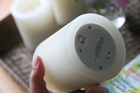
The candle body is very much wax, but guess what. They are 100% fake...

3

I fell for these when I saw them on display at Pottery Barn, when they had merchandised them in hanging lanterns. The soft glow was enough to make me inspect it further. I thought it looked so realistic. And I love candles, but I'm forever fearful of fire especially now with Oscar. Having a party, knocking one over...Perhaps a little bit of obsessive compulsiveness runs through my blood, so that itching worry is enough to make me go bananas.

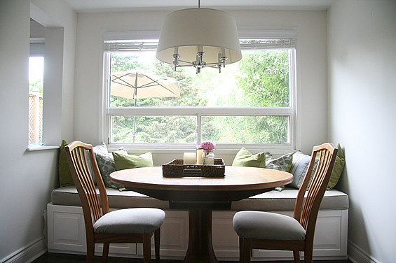
Although I have them on our kitchen table (right now) I will say this: For the best look, have them on a somewhere where you aren't staring at the lack of flame, because it's painfully obvious they aren't real when you see that no fire is coming out of it. But if you have them up high or in a lantern, then it is perfect. Because I think you have to see it to believe it...


Granted, these candles aren't inexpensive (it came to over $50 for the three) I had a gift card from Aubrey's awesome Aunt that made this splurge possible. (Don't you love when you can get things that you normally wouldn't be able to because of a gift card?)

Ps., oh yeah, you can also put them on a timer which I have yet to figure out. But that just makes me crack up. You could really throw someone if you tried...*wave hand over to the candles and they magically light up*

Pet Shop Boys Kitchen


The Mogul always appreciates something new and this concept certainly causes us to rethink things a little.
This compact and functional kitchen would be perfectly suited to the interior architecture of the Star ship Enterprise or would be the perfect functional prop on the abstract stage set at a Pet Shop Boys concert.  However just like Electropop this kitchen will not be universally accepted, instead it may find a limited following of open minded, artistically influenced individuals who may wear base ball caps and futuristic clothing!
Our approach to everything must change for this design to become main stream. 
Love it!

What didn't make it into posts....

Have a great weekend

Project "Curb Appeal", deciding on Window Colours

So it came down to two colours for our windows. Light (Sandlewood) vs. Dark (Sable). Because it was down to just two, I asked Ken if he could e-mail me some photos of the two colours on windows that they had done, to help me determine which one would be best for us. First up, Sandlewood, which was the lighter colour I was debating. It is beautiful, and classic - But it is kind of light. And for the extra expense of colour, well, I don't want it to read white.


Then there is Sable, the darker colour. And I kind of fell for it.
Honestly, I don't think we could have gone wrong with either. But Aubrey really loved the dark, Ken was confident it was the right choice, and so I signed off on Sable as our colour.

By going with the darker windows, it means we'll be painting the vinyl siding a lighter shade. I used the Sandlewood colour as the siding colour against the Sable windows. But we'll find a Benjamin Moore paint that will go nicely with the new windows.
 I'm getting conflicting information on how dark I can go with painting the vinyl siding, so I'm hoping to get some expert advice soon. And on the topic of painting the siding, I think we may do the back as well. I think painting the white will make it seem less like the back portion of our house was an addition, and make it blend in nicely. (Ok, I haven't convinced Aubrey on this stage of the project so this is still up in the air)

We're going to be hiring for the job of painting the front of the house, but to save money I would paint the back myself.

If you have a painter recommendation, I'd love to know!

Family Photos

Monday, Aubrey, Oscar and I went for a family photo shoot with Leigh at Tynan Studios. Honestly, I love her work but I kind of adore her just as much. She is soooo nice. She sent me this uber cute preview of our time in the park. I just simply adore the colours.

Here is a confession. You know what is so sad? I've avoided being in a lot of photos in Oscars 1st year as I've been so self concious of the weight I gained with the pregancy. But when I saw Leighs work, I knew that I just had to put my issues aside and have her capture us as a family. I can't wait to show you more of the photos!

Ps., The weight is coming off - slowly - but coming off. I hated what pregnancy did to my body but I'm forever grateful for what it gave me...and that is the little boy between the two of us. ;)

Rubik's Cube Kitchen

When it comes to functionality, mathematical precision, artistic expressionism, architectural influence and sociability you will find that good kitchen designers have it covered!  It is therefore only to be expected that the next step for this band of intrepid designers is to defy Mr Newton and gravity itself!
This abstract design gives the cabinetry freedom of movement on the vertical plane giving rise to a personally defined clustered structure under the worktop!
The Mogul approves!

Woven Trays

I've always loved woven trays. First of all, the tray itself is an easy way to keep things on a table/ottoman, yet have a sense of organization. And the woven trays are totally my style. I keep dreaming of when I have a big ol' tufted ottoma, I'm going to have a woven tray on it. Kind of beachy. ;) I fell for this one at Pottery Barn but did not fall for the price.. $50.


But then I was doing a quick late night run through Loblaws and spotted something in their home line...

2
Although not identical, and I kind of prefer the lighter style of the Pottery Barn style, this one was $15 and too good of a deal to pass up. 1

It just keeps my new candles, and some magazines on the table.
Tray available at Loblaws for $15.

Virtual Kitchen


This design is a virtual vision, a glimpse into what can be achieved when you have a disciplined, fertile imagination that has been honed to deliver functional satisfaction and aesthetical pleasure on many levels.  It is an example of what can be achieved when you employ a great kitchen designer.  So you should hire Paul Anater then, the creator of this concept!
The Mogul was drawn to this design because of its softness and warmth.  The colours and textures run into one another in a way that soothes the eye, inviting you to get tactile, placing your skin on the various elements that make the design different.  But you won't be touching this kitchen anytime soon!
The feature curve on the island that doubles up as a splash back is the hook in this design; offering femininely curved modesty to a cleaning zone that has potential to embarrass from time to time.  The island curve has been emphasised further by using a custom hood with a matching radius over the cooking zone and the stage is set by the wall units bowing out gracefully to the minimal, “cook’s kitchen” shelves!
 This design was never actually manufactured; it was created as a virtual brief solution for an outdoor kitchen for the website www.kitchens.com.  Amazing work!

Easy as pie thank you cards

Oscar was given some beautiful items for his birthday and I think it's very important to write thank you cards vs. e-mails. I thought that because everyone loves a photo of the birthday kid, I did a photo of Oscar with my favourite colour combination of blue + green preppy stripes. And I got it printed as a "photo" at my local photolab. Even though I run my own stationery studio, sometimes cheap and cheerful works, and is totally appropriate.


You too could do this by designing something to be 4x6 in your graphics program and saving it as a JPG. It's super easy. The photo I used of Oscar cracks me up. He's learning how to wave, so it was hilarious that the moment I got my camera out he started waving at me.

(
Photocards by me for my shop PennyPeople.com) Ps, The "We Design - You Print" option is a $25 design fee to design something like this, and then you just print it at your local photolab (No shipping or waiting for an order to arrive so it's super quick)

Move In With Me?!


This concept creation by Robert Lange celebrates the idea that the kitchen is a social hub, allowing people living in a communal environment to interact socially while preparing independent meals.  The space is also versatile enough to adapt to changing communal demographics. 
Many kitchens now feature duel cooking and cleaning zones in order to aid work flow and function but it is interesting to see this idea adapted specifically for a “flat share” situation. 
Maybe in the future we will all be forced to reconsider our living arrangements and these social pressures may remould our expectations of the kitchen.
Within kitchen design human and social elements dictate the equilibrium and influence the pace of change...we have interesting times ahead!