Leather Symbol Kitchen is X-Rated


The kitchen can be an expression of self identity and personal taste.  A custom designed kitchen can bring with it the type of social acceptance you will get from driving an Aston Martin! Your friends will envy you!
If you are lucky enough to be in a position to indulge yourself then why not have a shape shifting kitchen with hand-made leather doors and a handle that is a SYMBOL of your wealth!
Pocket doors with customised Blum Intivo drawers make this leather clad beauty X-Rated!

Sharp Kitchen Design

This kitchen looks very sharp right down to the cantilever which could be an issue if there are young children around!
The Mogul loves the large wall unit doors and the reflective qualities of the stainless steel worktop and wall cladding. 
Very nice indeed!  Hire a cleaner if you own this one and give the kids some protective head gear!

White Kitchen


Some people believe that the use of white can make a design appear cold but consideration must be given to the amount of light that will enter the room.  

The large sliding doors incorporated into this design allow the inside to become the outside.  This aspect of the architecture also allows the evening sunlight to bathe the reflective white surfaces incorporated here allowing the kitchen to take on a life of its own.

The ever changing patterns created by the path of the sun and the potential colour from the garden paint an ever changing picture on this white kitchen canvas!

Border Land

When the walls are removed an island can become a natural border between the functional and social elements of the space.  Our attitudes towards the kitchen are changing.  The kitchen has now become the functional aspect of our living room!

Architectural Kitchen

A classic example of how a simple kitchen design can be enhanced by the surrounding architecture. Or is the architecture benefiting from the simplicity and purity of the kitchen?  The contradiction in styles is fantastic giving this room the wow factor!

Picasso Kitchen


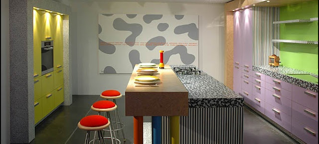
This concept by Eggersmann is so different The Mogul feels it deserves a closer look!
This kitchen uses vibrant colours and diverse patterns to present a disjointed but truly brilliant picture.  Although the choice of colours and textures seems to be erratic they are carefully chosen to make up this Picasso type design.  You only have to look at the handles on the island to discover that this is a calculated approach.
The Mogul approves! 
Ask yourself this...how would it look if you had a hangover?

Kitchen Colour


BESPOKE-COOL

Floating Kitchen


Precision engineering, asymmetric design, book-matched veneers and tasteful styling make this concept shine.  The island is beautiful, poised on four perfectly shaped legs it appears to be so light, it is gracefully elegant and was the first element of this design that caught The Mogul’s eye!
The Mogul really likes how the ovens are raised to a functional level and treated as a feature.  The designer has shown restraint here by not keeping the underside of the units at the same level on this wall.  This is cleverly balanced by the worktop splash-back which covers the same distance as the void below the ovens!
The design uses ultra light materials including 11mm thick doors in order to allow it to be free hung.  The only elements touching the ground are the high heels on the island. 

Swings and Roundabouts

The forces of Ying and Yang force against each other and cannot exist without each other!  The interaction between these two energies causes this design to work.

Designers can find inspiration everywhere!  Great concept!

Wooden Kitchen


Some of the most beautiful things in life are simple and un-complicated.   This simplicity can make it easy for us to understand and appreciate the meaning of what we are experiencing.  This designer kitchen is so simple in concept that it reaches far beyond many of the most complicated and flamboyant designs.
Made from solid chestnut and using traditional techniques this personalised creation by Effeti is simply perfect!
The chunky frame gives this kitchen strength, the flat slab doors and recessed grip handle cavity creates a modern twist while the natural wood finish takes everything back to bygone days when things lasted a very long time!
The Mogul absolutely approves, as this kitchen is absolutely beautiful!

3am Designer Kitchen Experience


Owning a kitchen like this brings with it a certain amount of responsibility as you must be able to explain your reasons for constantly visiting this space.  This may seem like a strange thing to say but if you are constantly being found in your pyjamas at three in the morning exploring every artistic aspect of the design, the other half may want to know what you’re doing!   
This kitchen reaches way beyond function; it has the ability to present itself for everyday adoration by its users!  The semi-recessed backlit units create a moody interactive experience for the viewer and this is heightened though the linear matrix pattern created by the doors.  Contradicting this is the nibbled edged worktops which brings the force and violence of a quarry blast straight into this design.
Add the complex and beautiful sink design and this concept is close to a perfect example of kitchen art!

Hidden Kitchen Function


Another shape shifter!  A splash-back and a worktop.  Brilliant!

Ultimate Kitchen Design

The Mogul has been here before and loves this!

Pucker up for the camera.  x

GOLD


This kitchen oozes the charisma of 007 (Sean Connery)!  The style is emphasized through the use of “Bling” accessories like the 24-carat gold leaf tile mosaic and the integrated flame thrower, which would be perfect for Bond to light up his cigarette with!

The Mogul loves how the tiles have been integrated into this design especially the pattern on the back of the island…Very cool!  The integrated fire adds warmth to the design bringing the living area into the kitchen.

Ask yourself this though…could this design have been enhanced further buy using a fully integrated dishwasher and removing the handles from the tall bank of doors along the back wall?  The tiling alone has made this design worthy of a slot on Kitchen Design Think Tank!

Thinking Outside the Box


It is nice to be different!

The Blue Kitchen


The Mogul likes this design from the Edwin Loxley stable as it is a fine example of an English country kitchen.  However the colours and materials used here step this kitchen out of the traditional arena and bring it kicking and screaming into the 21st century. 
The pale blue in-framed painted doors contrast well with the natural walnut and the design is softened by using quadrant posts and curved doors.  There is also an acute attention to detail with the cornice featuring a single strip of walnut.
The island is un-orthodox shape in order to handle the proportions of the room and make the cooking zone a social and interactive place to work.
The Mogul anticipates that this room will be used to entertain as there are several options integrated into the island design particularly the round unit finished in walnut.  This area sits proudly as a signature feature reaching into the room, inviting guests to help themselves to another glass of champagne or canapĂ©!

Where do you want the Fridge?


This is a luxurious space which has been enhanced through the introduction of a “shape shifting" kitchen.  This kitchen is designed to have its functionality neutralised when placed in a standby position, only to be revealed when the sliding panels move across the open shelf unit. 
The use of open shelves in a contrasting colour tilts this design towards contemporary living room furniture and the designer has been careful to add the same contrasting feature into the island adding continuity to the design. 
This is a great example of how good kitchen designers are considering how the kitchen, in an open plan space, can be the backdrop to our home lives.
However, The Mogul wonders about the two American style fridge freezers that are positioned along the left hand wall.  Their presence compromises the overall concept and it could strongly be argued that other options should have been considered!

Kitchen Karma


Traditionally the kitchen was an isolated and solitary place with one basic function, to prepare meals for family and guests.  Today the modern kitchen has become much more with good designers providing clients with an informed appreciation of architecture, art and holistic design. 
This kitchen by Crepain Binst is absorbed into the surrounding architecture and helps to define the space with the peninsula presenting a natural border between working and living areas.  The designer has also carefully considered that in this open plan space the kitchen will become the backdrop to the client’s home life.  The addition of a lighting panel on the peninsula introduces an holistic element to this design bringing it to another level and giving this design a timeless quality that enhances the architecture and the personal space.

Area 51 Kitchen


A vision of the future.  Takes me back to my last post!
The Living Interactive Kitchen Concept