A beautiful example of kitchen and architecture in perfect harmony! Shape shifting to boot...brilliant!
Slider Kitchen
Shape shifting kitchens are popular in open plan spaces as they allow the kitchen to become less obtrusive when not required. One popular and easy method of creating this concept is to use sliding doors to conceal the functional elements of the kitchen.
In many cases the designer will use the same components required to create a sliding door wardrobe to create this kitchen feature.
It is very cool to slide the doors back and make the kitchen disappear but it can become very annoying if the chosen designer has not properly thought through the individual cooking patterns of the end user!
It is very cool to slide the doors back and make the kitchen disappear but it can become very annoying if the chosen designer has not properly thought through the individual cooking patterns of the end user!
How annoying would it be if you proudly slid back your wardrobe door, or should we say kitchen door, to reveal your new expensive ovens, only to find out that the door you have just moved is now blocking access to essential ingredients and non-consumable items needed to prepare the meal for your guests! Those doors better be on a good running system because they will start moving with great speed as tempers wear thin!
This design tries to address the issue by having a window displaying the ovens. The idea is great but you could argue that it defeats the original purpose of the sliding doors! This design is exceptionally good though with careful consideration given to functionality and aesthetical appearance. The mixture of aluminium framed glass doors and stainless steel worktops make this kitchen appear very desirable to the modern user while the veneered wooden doors add a little warmth to the picture.
All in all a great design but The Mogul always prefers to use pocket doors were possible!
Check out the KWC Eve tap with integrated LED's. Very nice!
Hey Blue Eyes!
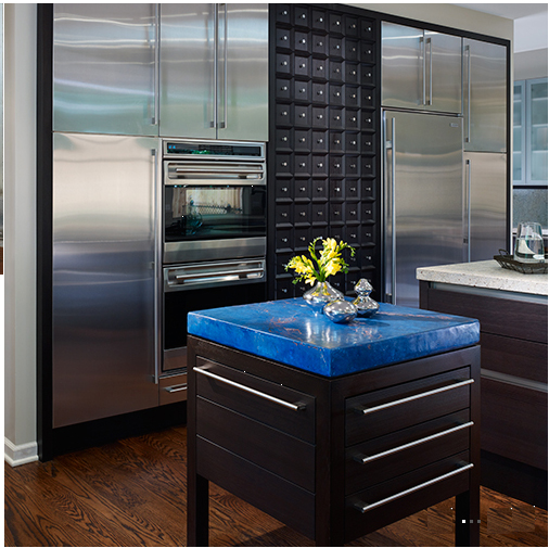
Mick De Giulio is argued to be one of the best kitchen designers in America and going by this example it is easy to see why he is in the running.
This design says a lot of things to the viewer and The Moguls knee jerk reaction is to shout out medieval contemporary! Contemporary because of the dark wood slab doors, mixture of t-bar and recessed grip handles and acres of muscle bound, stainless steel appliances. Medieval because of the handle peppered doors between the tall appliances and the luxurious stone!
Oh yea..in case you hadn’t noticed that blue stone on top of the free standing serving table...The Mogul thinks that it defines the entire space and is absolutely beautiful!
Some people perceive contemporary kitchen design to be cold and clinical but this design dispels this notion completely!
The Mogul approves.
Operating Table
Cool and clean, just like any operating theatre! The rawness of the architecture and sliding doors give this design a serious edge!! Maybe the cosmetic gastronomic surgery is preformed front of house with the less beautiful activities happening behind closed doors!!
Cross Dressing Kitchen
This design is quite simple and safe, straddling the divide between traditional and contemporary. The doors are shaker style painted and have been formatted to fit snugly into the architecture.
Designer Sean Cochrane has made a feature out of the possible problematic high ceiling, adding a feature ladder in a contrasting timber gives secure access to the very high storage. A good place to place the forbidden goodies!!
However, the feature that makes this design different is the very long island top with custom turned legs. This feature draws the eye and certainly is different! The shape of the legs are almost human!!!
The placement of the grandfather clock is brilliant and is the final piece of wardrobe required by this contemporary / traditional cross dresser!
This one won the IDFX awards 2010.
Boat Kitchen
If you live on a flood plain that is prone to flash flooding then this is a great investment! Not too sure about this one! After 5 years you may want to abandon ship!
Bridge over troubled waters
This design exceeds all expectation as it is a piece of function art.
There is a serious amount of self expression in this design allowing the viewer to appreciate the innermost feelings and tastes of the designer and the client.
The main show stopper here is the island, or should that be islands! The two islands are set at a lower level and are connected by a dramatic bridge which has been elevated to an ergonomic height.
This bridge has been designed to create the illusion of being a solid slab of worktop but it actually conceals some very functional glass bottomed drawers; a bit of a speciality from manufacturers Valcucine! The Mogul loves the fact that the designers have created a recessed cavity between the lower islands and the upper bridging worktop, doing this makes it appear that the bridge is floating, giving this design some contemporary class!
This kitchen has style and is a great example of how personality can be expressed in every kitchen design.
Classically Contemporary Kitchen
The Mogul thinks that this image is beautiful! Linear white design with flamboyant coloured curves! Fantastic!
Now you see me, now you don’t!
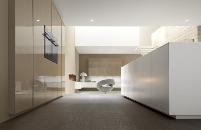
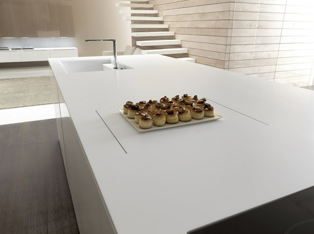
This “shape Shifting” kitchen from Florida Furniture proves yet again that designers are infatuated with hiding the biggest investment you will make in your new or refurbished home.
Would you buy an Aston Martin and hide it in your garage? No is the answer, instead you would happily drive it to nowhere just to enjoy the ride and you would take great satisfaction in the social acceptance it would give you....so what is the idea behind hiding your new expensive kitchen?
The Mogul believes that the kitchen is not only a functional space, it is part of the architecture, it shares your private space, the design may have been inspired by your personal tastes and therefore it can be seen as a reflection of self.
It is therefore fitting that the very best kitchen designers will allow the kitchen to change; adapt to its surroundings, complementing both the architecture and the mood of its owner. It’s like having a convertible Aston Martin...when the weather is good you may want to drive around with the top down! Having a kitchen that caters for your every whim will give you pleasure, giving you a product that is great value for money.
Some of the “Shape Shifting” ideas are extreme but these forward thinking concepts will become softened and manipulated into mainstream designs for now and the future!
Keep up the good work!
Cascading kitchen
This is a cook’s kitchen and this cook has some style. The cooking zone dominates this design with the extraction system becoming a strong visual feature.
The overall appearance of this kitchen is impressive as it bolts with untamed passion from the contemporary stable! The worktops are raw and imposing as they present themselves for admiration and cascade from the walls. Add to this the atmospheric lighting cavity and utility rack which allows for kitchen functionality to be fully addressed!
There are subtle touches here that help to make this kitchen design special, such as the slightly tiered worktop levels and the super cool glass doors.
This kitchen looks absolutely brilliant. Oh yea it’s made by Rossana!
And the Lord said "Let there be light"!....Upon my island!
This image captures the light and invites you to appreciate the beauty of the design. Having your morning coffee in this environment would be a very pleasant experience, encouraging a sense of place and an emotional connection with the kitchen.
Cool Colour
The Mogul likes the use of vibrant colour here which is enhanced by the splendid architectural surroundings. Check out the Elica Stone Gallery extraction system!
Very Nice!
Mirror Mirror on my Kitchen...!
A successful kitchen design must be able to touch the heart of its owner, inspiring them to appreciate their purchase, content in knowing that part of their very being was pivotal in inspiring the design. No better way to see yourself in a design than to actually see your reflection in your custom etched mirrored panels. This is fantastic, and is so indulgent that it makes The Mogul smile!
The Mogul also loves the stepped worktop, which helps to give this design some depth and energy, and creates a very dramatic feature. Brilliant!
Hinging the doors under the hobs and including an internal drawer system would cause The Mogul to raise an eyebrow though!
Colourful Kitchen
This eclectic open planned space by Atelier Exquise is a perfect example of how kitchen design is evolving. Good designers consider function and ease of use as the foundation for their designs, building on this primary purpose to consider sociability and human well being!
Knights of the Round Table
When King Arthur gathered his Knights around his famous round table to plan their next adventure they may have enjoyed wine, song and feasts brought to the table by local serving wenches!
The round table of tomorrow is a fully interactive, multi-purpose appliance that facilitates the sustenance of the average family unit! This concept kitchen has pop out appliances that allow this design to be classified as a “Shape Shifter”. The designers have come up with some interesting ideas such as using the dish washer as a non-consumables storage zone, but this would certainly have its limitations if you have a large amount of crockery or a small amount of dishes that need washing...God forbid that you may have to bypass the technology and use the age old method of washing up!
However, one of the basic reasons for having a round table remains the same. It enables those trusted members gathered around it to look each other in the eye and communicate. This is a secret to successful kitchen design as social interaction and holistic atmosphere can define the space in which the kitchen sits making the kitchen a positive place to be!
How would you like your thriller? Rare or Well Done?
Crisp and contemporary, this design shows how the boundaries between traditionally defined spaces have become blurred. Open shelves have been used here to bring the living space into the kitchen...or is it the other way around? These shelves have created a stunning library, great for a vast collection of cookery books.
The Mogul would question the position of these shelves. From a functional aspect it may have been prudent to keep the ovens behind the island and closer to the hob and sink moving the library to the right hand side of the room.
Consideration must always be given to the distances travelled between functional elements when cooking, as this can make a good design brilliant!
Looks great!
Subscribe to:
Comments (Atom)


