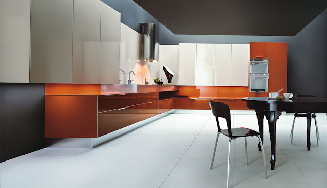
The Mogul loves this kitchen by Cesar as it doesn’t conform to standard kitchen design. Standard door matrices are thrown out the window to create this look! Or are they?
The wall units are oversized in order to maximise storage and are carefully positioned so as not to interfere with the worktop. The kitchen has multiple levels and when matched with the vibrant colours creates an immediate and interesting visual impact for the onlooker.
The oversized glass doors used on the wall units also double up as a very handy splash-back behind the main cooking and cleaning zones giving the impression that the wall units have continued around the wall and become recessed. The lower level red glass units on the back wall also give this kitchen a living room type feel as the space between them and the underside of the wall units creates a handy shelf/ alcove, perfect if you want to personalise this space!
This kitchen is imaginative and could easily be created using standard sized doors and on a budget so top marks to the designers here for coming at this from left field!
