Who Are You?


Visiting your kitchen should be something to look forward to.  After all it is a material but functional expression of who you are and what you like.  
From certain angles the mirrored panels incorporated into this design allows the artistic preferences of the user to resonate throughout the space.  These artistic preferences have developed over the seasoning of your personality and have been spawned though relationships and intimate conversations.
Fitting then, that your domestic inner sanctum should pulsate with your aura; giving out strong comforting signals that you are indeed home. 
This kitchen is beautiful, understated but chic, cosmopolitan enough to make a social statement without the need to brag!
Welcome home – Kitchen Design is Changing!

Living Room Area Rug, Ordering Samples...

Although the sudden purchase of the furnace halted the living room area rug search, I still keep my eyes open for one, for when our budget allows. It's not that I haven't seen any I like, we just don't have thousands to invest in one at this point in our lives. 

I spotted this carpet from Shaw. Shown on the front of their website it says it is a "Bound Carpet: Urban View in Cobblestone". It looks slightly blue and reminiscent of this rug from West Elm. So, I called Alexanians and they had no trouble ordering in a sample. It would have to be cut to size but the image below was promising! This weekend Aubrey drove by the store and borrowed the sample to bring home.


But look at it in real life....

How on earth could these be the same? Although the pattern is the same, the colour is very different than what they show on their site. (And Alexanians did 100% order the right sample)

So although this post shows us no further along our hunt, it is a great example illustrating why I have a phobia of buying big purchase items like rugs, sight unseen online. Although I hadn't anticipated this major colour difference in the rug, it's reminding me I should just stick close to home and buy a rug that I could easily return if its not right.

Architectural Kitchen Designer

Historically the kitchen played second fiddle to the architecture with kitchen designers finding their avenues of self expression restricted by steel and concrete.  But increasingly the kitchen designer is being invited into the limelight by the architect and the client and providing architectural definition within their designs. 
This kitchen illustrates the point perfectly as the bulk framing around this design showcase how future architects may only be required to present the client with a cavernous space so that the “newly appreciated” kitchen designer can work a little magic, giving the client a highly versatile piece of functional artwork.   Having internal structures created in this way also means that the inner space is more flexible and more easily adaptable to the changing personal and demographical circumstances within the home over the years to come.
We are entering the age of multi-discipline respect and communication, the age of the architectural kitchen designer.

Friday Love

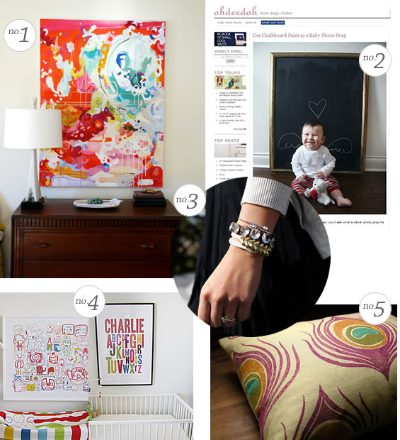
1. Love the Artwork that Erin found + blogged about No. 2. The photo we took of Oscar for Valentine's Day was featured over on our favourite site Ohdeedoh 3. A DIY bracelet that I love found over on Sarahs blog 4. A great nursery (Love the colours) that happens to feature my art print! 5. I think Peacock is making a comeback. See Kirstens roundup. Don't you love that pillow!? Have a great weekend! xoxo Lindsay

Basement Bathroom Shower

We finally got around to installing the shower set in our bathroom! Oscar wasn't feeling well this week and just wanted to be in my arms, so Aubrey took the time to install the shower set in the bathroom as Oscar and I watched. To see water coming out was so exciting. The little things are sometimes soooo awesome.


We installed a Moen Set purchased at Home Depot.We felt slightly rushed picking the set as our Plumber told us the day before he came that we needed to go out and find a style we wanted so he could rough it in. I was under the impression that a rough in could be a standard thing ..... and you pick the set later. But I was corrected. (Although I would still like to research this more) Regardless, I'm happy with the look.

Next up we have to seal the tiles! We'd love to add in a glass partition wall but sadly it is out of the budget right now. But the shower can be used if we install a tension rod & shower curtain. More reveals of it coming soon!

Tip: What I did know is that I wanted a toe kick part for the shower stall. Why? I though if we, or the next owners of our house have 4 legged friend you could wash their feet in here. If Oscar gets muddy boots, I could wash it here, or fill up a tub of water using the toe kick part without getting sprayed by the shower head.

Sarcophagus Kitchen Sideboard

Your new kitchen art installation – the modern kitchen sideboard by Antoine and Manuel! 
LOVE IT

Runner for our Main Staircase

We're in need of a runner for our main staircase.  My problem with Runners was that they either looked too fancy or ornate, or not special enough for our main stairs. We've been hunting for awhile, stopped, and picked up again a few months ago when we went to Alexanian Carpet.

We were really happy with the service at the store, having already bought Oscar's Nursery carpet from them, and we used the remnant of that on our runner to our basement. They let me fill my car with samples to bring home...which I did. Just like paint and fabrics, carpets will look 100% different in your house than they do the showroom. So take them home, and test them out.

While at the store, I spotted a Cortenaer Wool Carpet in a Stripe. LOVE at second sight.

 You see, I had seen this carpet a few years ago at the Interior Design Show at the Exhibition Centre and fell in love with it. I think it is the perfect mix of traditional (stripes are traditional right?) but unexpected and youthful at the same time.  The colour in the photo is slightly off, but it's a great mix of greys.


 Looove it!

Leading Light


This is an exemplary example of how to create a classical look with a modern twist.  This kitchen by Design Republic is beautiful and uses soft colours and traditional lines to provide the cautious client with comfort and reassurance.  There is nothing dangerous in this design and it evokes a feeling of calm right down to the artistic and personal pattern that has been backlit through the translucent Corian worktop. 
The Mogul loves this one because it is a traditional kitchen that has been led into the 21st Century by the power of light and modern materials. 
Great Job!

Impulse Buy

Perhaps it's because the sight of the last post seemed so boring and blah. I just bought two of these beauties.

When a big piece of metal ruins the decorating budget

Last week I woke up to feel a slight chill in the air. I knew immediately that our furnace was off.  Our repair guy Brian came an hour later, tools in hand to see what was up. We thought we had fixed it the first day, but by evening it was off again. The next day it happened again, and again.  It was a bit of a stressful week as every time you realize it wasn't working, it was a mix of emotions. Frustration, panic, worry. There comes a point when you wonder what to really do.  Brian was trying to save us from getting a new furnace, but service calls, even at a great price, add up. The furnace was old, was uncared for by previous owners, and was on its last legs. We knew the time was going to come one day, and it turns out Friday was the day.
Except for the venting they look relatively the same.

Although I was so sad at having to shell out that money we hadn't expected, it felt good knowing that we were getting a new furnace that would be High Efficiency and heat our house better. It means sadly that some projects are on the back burner for now. C'est la vie.

So, we're the proud new owners of a new high efficiency furnace. It is quiet, blows hot air much more powerful through the house, and makes our bedroom feel like a hotel when you hear the air come on at night. :) Its a definite improvement to the house, for our enjoyment and for resale. It will also help with the air conditioning this summer thanks to the more powerful fan.

We met Brian though a nice connection. A favourite organization of mine, which I have talked about before is George Herman House. It is a home for women living with Mental Health issues. Every year they hold a silent auction and 2 years ago we picked up a handy man service. We finally redeemed that gift certificate this past Fall. The handyman David was so nice and awesome. (Anyone who supports charities in my mind gets bonus points) and his partner in the business, is Brian - who does Furnaces.

Transformers - Kitchens in Disguise


The architect and builder have provided you with a space, how are you going to define the space?  Do you decide to create an intricate array of cabinetry that covers every inch of available wall space and is linked by a spaghetti junction of pelmets and other elaborate dust collectors, or do you decide to make an understated statement of style.
The Mogul read somewhere once that the kitchen is an island with a backdrop of artistic self expression, and this is true, but the kitchen of tomorrow is also a shape shifting modular masterpiece that has the ability to interact with its user. 
The Mogul appreciates the power of shape shifting kitchens and this example from Linea Quattro is no exception.  Sitting in a standby position this kitchen offers uninterrupted earthy colours that empower a stereotypical vision of contemporary living.  Consisting of only two elements this kitchen lays dormant, ready to be awakened by human functional requirement. 
An array of sliding panels allows this kitchen to reveal its inner self, reflecting the legacy of its ancestors and the reason it came to be created....Function!  Like a robot transformer it glides seamlessly between states of use offering its user visual and functional satisfaction as well as the type social acceptance that breeds envy.
The kitchen of the future is happening now!  Are you ready?

Finding that perfect piece of artwork...

I was browsing Apartment Therapy and they had a post on First Dibs.  I spotted in the photo on the left, a painting that is totally my style.

I proceeded to visit Stellar Union's site, and found it.


It is an oil on Canvas by Willy Mucha.
Abstract oil on canvas by Willy Mucha (1905 - 1995), in gold leaf frame.
Available at Stellar Union for $10,000.

Anyone looking for a group gift for my birthday? You know, chip in a few dollars from your penny jar. :)

(Top photo from ApartmentTherapy.com and Artwork image from Stellar Union)

White Kitchen - It's a class thing!

White kitchens have a funny way of indicating what type of person you are.  Looking at this image most people will initially think that this space is beautiful, portraying an iconic lifestyle that is closer to the runways of Milan than the houses “normal“ people live in!  Some people will run with this initial thought without any further need to question it, with a quiet aspiration driving their ambitions to own a kitchen like this.  Others however will then begin to think of reasons not to like it; with property resale, upkeep and lifestyle being cited as reasons not to buy....oh yea and possibly price.
The Mogul feels that these simple observations into the physiological processes of the kitchen buyer indicate that kitchen design is a fashionable statement of class and social status!  Maybe this is one of the reasons why contemporary kitchen design is not available to everyone...only those who can afford it! 
However, clever design and use of materials can make this type of kitchen affordable, you just need to hire a good kitchen designer!

Bear Chairs

Maybe this is a good sign of things to come....Remember our Bear Chairs that we bought last Summer? Well, Costco has them back in stock!  And at $49.99 I'm pretty sure they will sell like hot cakes.  If you have room to store the boxes grab two.


Wishful thinking that Spring is around the corner? I'm so tiered of the snow!

Artistic Kitchen

The quicker the industry realises that the kitchen of tomorrow is an island with a background of artistic self expression....the better!

Thank you for the mentions!


One of my favourite elements in the Nursery is a card from my Brother, Peter.
 Today on "A Brooklyn Limestone in Progress" Stefanie asked us where one of our favourite nooks are in our house. It was a tie between Oscar's little day bed, and our Kitchen Bench nook. In both cases Ikea played a role. High Five Ikea. Pop over to her blog to see the post. :)

I was personally featured over on True Cuddles. Oscar looks so tiny! And a few weeks ago I was interviewed by Barbara as a kick start to her "So Canadian, eh?" series and Brittany did a roundup of some of her favourite rooms in our house.
* The card from my brother is hilarious. It sits on the bookshelf by Oscar's day bed. We were finding out the sex of our baby on a certain date. When we found out, we proceeded to head up to my parents. My brother had made up a card that was a "fill in the blank" so the moment we told him it was a boy, he disappeared for a few seconds and came back with it filled out. Had it been a girl, it would have been so different!

That's a Wrap!

The Mogul loves the integration here!  The Architecture is just hugging this kitchen which is incredibly stylish in its own right.
The units above the cooking and cleaning area just hang in space and this feature illustrates that there are real kitchen pod tendencies here. 
The tall unit integration with the architectural wrap really works well because of the detachment from the exterior architecture of the building.
The Mogul Approves!

Falling for the unobtainable

I am swooning over the West Elm rug as seen on in the abode of Emily Schuman, the writer behind Cupcakes and Cashmere. (Featured on Apartment Therapy) I'm a little surprised I like it as I'm more on the side of traditional.
This rug and I have a little history. You see, I spotted this rug and fell for it the other night I was lying in bed,watching E! Fashion Police. (Don't judge) I tweeted that I liked it, and @LnlyWifeProject  responded and told me it was likely West Elm. She was right.  It is the Beaded Diamond Dhurrie rug.  (see the set design of E! Fashion Police here)

Being on sale, means other people grabbed it and I was out of luck. Really, it's not what I would have thought to initially put in our Living room as I feel as though I air more on the side of traditional, but for the right price I would have played with the idea of adding something like this in our house, especially after seeing it in Emily's place.  The hunt continues!

Credit: Photos from Apartment Therapy

SEX SELLS

Kitchens are becoming more delicate and feminine with a bashful charm making some models appear venerable and submissive.  There is a tendency for designers to conceal the kitchen within the surrounding walls making it invisible; the kitchen is being taught some manners and now only speaks when it is spoken to!
But silence and mystery can be very powerful.  Slender worktops, handless doors, transforming elements and appropriately placed appliances convey a smouldering persuasiveness that means you want to get to know the creation lurking within your home.  There is a desire to expose the beauty that the nasty designer has tried to hide and there is a need to lay your hands on the forbidden elements within the drawers!!
The exterior softness portrayed in many modern designs is only superficial and just like the modern woman, these new kitchens are articulate, able to do the job and in some instances radiate a powerful dominance!
The modern kitchen is now a genderless space with manufacturers now using marketing and styling techniques adopted from the motor industry to attract both male and female buyers.   What do they say SEX SELLS!
Happy Valentine’s Day from The Mogul!

Happy Valentine's Day

Happy Valentine's Day!  Oscar woke up to a little Valentine's Day table like my Mom used to do at every holiday. Doing things like this makes me remember my childhood and how much effort my Mom used to put into making things fun for us kids. Here is to traditions, and hugging those that you love.

xo Lindsay, Aubrey and our little Cupid Oscar.

Baby Wearing + Giveaway

One thing that has surprised me since having Oscar is my parenting style. Before having him, I didn't give much thought to our philosophy, or views on how to raise a happy healthy child.  For example take the term baby wearing - something that I initially heard from my good friend Stephanie but brushed it off. At the time I felt that any parenting style that was labeled seemed too precious and forced. But, since having Oscar, it worked its way into our lives as it just seems right to us.  I haven't packed up my stroller - it will come back out this spring for nice long walks along the boardwalk, but the carrier has been a great addition to our lives.

Oscar was content in the Boba Carrier for 3+ hours as I watching Aubrey play football in the snow
Oscar loves being carried, doesn't cry when he is in one, and calms down the minute I put him in. That is enough for me to love it.  Back during Mommy week I talked about the Ergo carrier and got to give one away. Fast forward to recently and I got to test the a Boba carrier. I'll be honest. It's hard to knock the Ergo because it was the carrier that changed our lives, but the Boba is the one I'd now recommend as my favourite.

Why I love it - The similarity between both carriers is that the legs hug the wearer (me). Instead of like in a Baby Bjorn where the legs dangle. However what makes me love the Boba is that (1) The Boba has a more generous waits band making it a more comfortable fit for my hips (2) the fabric feels softer and more plush (3) The height of the carrier is slightly taller, making me feel like Oscar is better supported and (4) The Boba also has little foot straps so his feet won't dangle when he is older. Like the Ergo the Boba can be turned into a back carrier, and like the Ergo it goes up to 45 pounds (See a chart on comparing the Boba to the Ergo)

Really in the end, it is the fact that the baby is close to you that I think is the best thing. Since I loved the Boba so much, the team at Boba want to give you the opportunity to have one as well so you too can experience the joys of baby wearing.

Enter to Win a Boba Organic 2G Carrier ($118 US) in your choice of Walnut, Pine or Chestnut. Open to Canadian and US residents. One entry per household please! (To make it fair for everyone)

How to Enter: Visit Boba's website and tell me what your favourite colour of carrier is.

Bonus Entry: "Like" Boba Carriers on Facebook. Do a second blog reply telling me you did so + include what your full name is, so if your name is drawn we can verify you "Liked" them. (I do check!)

Contest over! Will be drawing name shortly, so check back for the winner on Monday afternoon
Winner Drawn! It was #63 and that is Brooke! Brooke I will shoot you an e-mail but if you read this before I get a hold of you, then shoot me an e-mail to aubreyandlindsay[at]hotmail.com. Congrats!

Week Recap

Here are somethings that happened this week that didn't make it into blog posts....
  • I'm working on some new prints, and am figuring out some new ways to photograph my artwork.
  • We are going ahead with website redesign for my business site,. It won't be a big shift in design but a needed update.
  • Tuesday, my Mom and I went to the Elmwood Spa (Pic 2.) here in Toronto and experienced the best massages, facials as well as customer service. It was a needed break, and I got to spend some quality time with my Mom.   
  • I'm still searching for the perfect rug for our Living Room. (Picture 3 + 4)
  • I've been reading the 3rd installment of Grace's posts on the Alt Summit and social media etiquette. (Pic 1) It sparked some great conversation between Erin and I as we had our Thursday afternoon coffee date with the babies.
  • Oscar (Pic. 5) popped his first tooth - one of his bottom middle teeth in the last 3 weeks and another one looks like it is on its way up. He has realized that he can get places by moving himself which is changing how we do things!
  • I was asked a series of questions by Barbara (Pic 6) to kick start her "So Canadian, eh?" series on her blog, take a peek! Brittany did a sweet post of her favourite project from our house over on Gallery No. Eight. It's always fun to see our house on other blogs.
Last but not least, thank you for all that gave me awesome feedback and encouragement with ideas on what to feed Oscar. Although I didn't reply to each of you just know that I am reading each comment and appreciate the time each person took to share.
xo

Shape Shifting Evolution by TM Italia

Petra by TM Italia - Epitomizes The Moguls design ethos – sit back and enjoy the ride! See it at Grand Designs Live 2011!

Biblical Kitchen


Exuding an age old quality that has transcended the generations since the beginning of time this island looks as though it could be loaded up, two by two with animals galore and set sail into a flood of biblical proportions.  This is a timeless design that sits fantastically well within bland but expansive surroundings, adding warmth and texture to the architectural space.
But this ark has been supercharged with an industrial style extraction system, and a tap that is powerful enough on the style front and creates enough water transfer, to make sure that this baby doesn’t go down, no matter what size the squall!
This design represents a great mix of traditional safety and contemporary minimalism.  Looks great and The Mogul approves!

Multi-Media Kitchen


It is only a matter of time until that lift up panel becomes a fully interactive, LCD, touch control home entertainment system...That's what The Mogul would do anyway!  WATCH AND COOK!

Move over Restoration Hardware

HomeSense hit a home run with their latest collection at the store. I normally bypass their furniture, as it's usually in bold, graphic patterns which have limited uses in our home. But their latest collection is white washed, linen and soft muted colours and I was going bananas over the finds. If I were outfitting an apartment right now, or small condo, I would have gone ballistic. I picked up 1. and 2. for our front hall makeover. Think High/Low - Restoration Hardware on the High End, the current collection at HomeSense on the low.
Wouldn't the chair (3.) be amazing as a pair? The love seat (4.) was under $500 if I remember correctly and that wing chair (8.) was $399. I hope they continue on with this trend, as I would make more stops into the store if they hit home runs like this.

Ceiling Kitchen


Here is an interesting idea; why not have your kitchen integrated into the ceiling.  This design by David Oelschlägel + Henrike Louisa Binder from Germany utilizes the space above head height as storage.  

The bucket lights have been designed to have storage space included, useful for small consumable and non-consumable items that would normally be stored in base units.  Once you have finished using the bucket to retrieve the required items you simply pull it down a few centimeters and it goes back up to its original position.

This idea is certainly more concept than mainstream but it does highlight the fact that there is a lot of un-used space above head height, normally allocated for lighting fixtures.  In the future, if living space becomes more limited we may have to consider using this space in a transforming fashion in order to make our living environments more comfortable.  However, there is also the possibility that doing this will create a claustrophobic environment that will discourage a sense of calm and well being within those who occupy the environment.

The Mogul encourages all things new!

Baby Food and an 8 month old

Oscar just turned 8 months old. It seems like yesterday he couldn't hold his head up, and now he's doing the worm across the floor, figuring out how to get to MakMak the cat, or crawl over to me from across the room.

For a few months now we've been introducing new foods to the little guy. First was rice, then it was peas, sweet potatoes, carrots, bananas and blueberries. Recently I tried pureed turkey and he wrinkled his noes and gagged. I gagged too after I tasted it. I'm feeling apprehensive about what to do now, and I panic that I'm going to be feeding Oscar pureed foods for the rest of his life in fear that he will choke.
Joanna from A Cup of Jo brought up the same question, asking others if they had recommendations on what to feed babies, and I would love to know if anyone had any books. My Mom made up some batches of organic vegetables, apples and Bananas (Thanks Mom!) and Oscar is devouring them. Anyone have any cookbook suggestions? Or even just some words of advice on how to proceed?

White Kitchen

Understated functional beauty; apart from the gold units to the left of the image which are a decadent expression of social standing!
Notice too how the units are formatted below the cooking zone!  Linear simplicity is being corrupted in order to create interesting functional spaces!  Brilliant!

Dining Room Makeover - Trim complete!

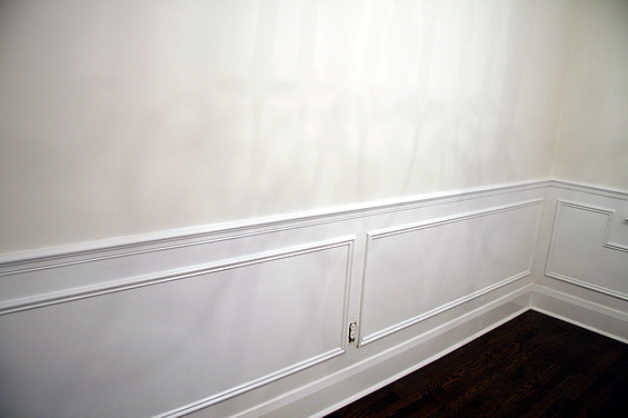
I finished painting the trim! Whoop! It looks soooo awesome. Here is what I did.

Everything beneath the chair rail Chantilly Lace by Benjamin Moore. This is the trim colour throughout our house. After painting it all that colour it makes the original wall colour - Cloud White, by Benjamin Moore, stand out ---- Enough that I'm contemplating the wall colour as is. It is a beautiful buttery colour. The trim has not only made the wall colour pop - but it has also made our chandelier unfortunately stand out. Before I didn't mind it, but now I think we really need to switch it for something with a drum shade to make this room feel modern, not old ladyish.

Decisions, Decisions.