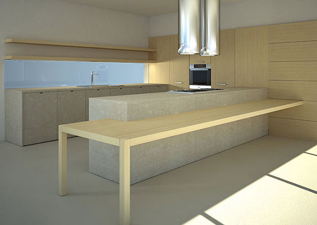
Natural elements can bring out the basic instinct within us allowing innate, subconscious memories to surface. No two materials do this better than wood and stone.
This design emphasises the simplicity of the chosen materials by omitting the wall units and introducing some “plank like” shelving along the back wall. This brilliantly clean feature gives the end user the option of displaying some of their personal functionality, making the space their own!
The overall effect is enhanced by the having two opposing, plinth-less monoliths that are harnessed together by the tall, recessed units along the right hand wall. The overall effect is to create an impressively minimal but functionally adaptable space.
Enter some asymmetry! A two legged table that cosy’s up to the island and off-sets the picture. This feature is very strong and could easily accommodate a long line of hungry mouths. Just as well the cook is protected within the eddy of function behind the island!
