D-Day (Demolition Day!)

This past weekend was a big day! It officially marked the beginning of the reno. When I arrived at the house, I could hear jack hammers and voices in my basement. To my surprise, the concrete and sewer crew was happily working away, digging out my basement but that will be another post, another day.

Prior to the weekend, Nick removed the bookshelves from the dining room and the kitchen cabinetry. My plan is to try to use the existing cabinetry for other rooms in the house; the shelves will either go in the den or in the basement for storage and the old kitchen cabinets will be used in the laundry area.

My cabinet maker hard at work.

This kitchen will be demolished, so I have saved anything
of value for either other areas of the home, or to use for
trade at other used stores.


Saturday's demo began with the paneling on the wall. After consulting with drywall expert, Andy, the decision to remove all the paneling was based on the idea of starting "fresh". Because some of the paneling was warped, troublesome and down right ugly, the decision was made to put some elbow grease into those walls and tear it all down. The boys really enjoyed themselves during this process. I also rewarded them with cold beer, which helped.


Paneling coming down.

First wall exposing plaster and it's ugly wallpaper.


This is the construction of the walls. Layer 1 is the lathe (wood
slats), Layer 2 is where the plaster is spread over the wood to create
a solid wall. Lastly, and only in this home, there is a third layer of
wood paneling that covered the plaster and lathe.

The lathe was in surprisingly good shape. We have decided to leave it up and cut around it for heating/cooling ducts. While the boys were downstairs working, Mom and I were trying to salvage some of the okay plaster walls to avoid drywalling the whole house. Instead, we peeled a stucco like adhesive on top of old wallpaper(s).
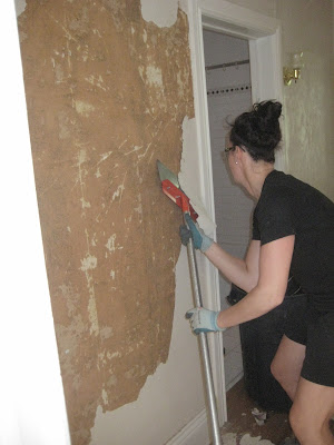

I ditched the hand scrapper and used the floor
scrapper. It worked great, but be careful about
the corners digging into the paster.


This is the beginning of the mess...definitely just the beginning.

And while we worked, this is what was happening downstairs....


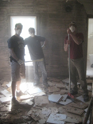
Crow bars. Mess. Shovels to clean.

Dusk Masks. Safety Goggles. Safety always first.
My workers. My mess. My gratitude for all their
hard work, and joking personalities ;)
This is now the state of the old living room, new kitchen.
Can you visualize it yet?!

Once the plaster started to come down, and my anxiety rose, I realized that this was the right thing to do. There is nothing better than figuring out what is behind the mess versus covering it up. Imagine after all the work is finished, painted and beautiful, then suddenly you find out their is mould or any other issue? That would be worse than experiencing a day of mess and dust! Fundamentally, working from the basics and making sure all of your "ducks are aligned" is one of the most sound pieces of advice I can give you for a reno, especially on an old house. Surprises will come up, and I am lucky that thus far, I am in the clear but let's be honest...it's only the first week of the project!!

Thank you to all of my helping hands. I truly could not have done it without you.

Next up on the schedule is fixing the dungeon basement and removing the kitchen....

Stay Tuned!


Temporary Fix to Ugly Tiles...

One room hasn't been shown, and that is our Master Bathroom. Let me show you what we started with.  It was yellow and pretty gross. The following photos were from when we walked through the house right after buying the house + are with the previous owners stuff. I honestly look back at these pictures and think we were pretty brave for taking this house on...


Awesome eh? But we had no room in our budget to replace anything. We were faced with a dilemma. What was a way that we could update the bathroom temporarily and inexpensively, to help us hold off on doing any renovations. I also wanted a nicer bath, as I love my baths. So, our fix was...you paint!

 We hired someone to come refinish our tub, and at the same time, paint the yellow tiles.
It was a temporary fix that cost us $1,000. It was money well spent as since them I've been able to enjoy baths and feel as though our bathroom is somewhat appealing. 

But here is the flip side. With any temporary fix, there is that word temporary. The bathtub is showing signs of wear and the paint is chipping in certain spots. We are doing everything in our power to extend the life of our little bathroom. The two rooms, our Kitchen, and Master Bath are the only 2 rooms we never touched, and, the two rooms that are showing MAJOR wear. Aubrey actually said to me "It would make sense to do the bathroom at the same time as the kitchen." to which I freaked out at the idea of TWO renos going on. (Not a good freak out, but panic freak out!) So we kind of have two renovations that we are researching now....Give me strengh.

A Test Kitchen!

What do you see here?  Is this a kitchen, a piece of art or is this the blatant exposure of functional kitchen zones?  Each independent zone has a relationship to the other and can be universally configured to the meet the requirements of any individual. 
This kitchen is a test, a means of establishing what is important to you!  Would you choose this kitchen because it is art or dismiss it because it is unconventional? 
The answer you choose will have been determined long before the question was asked by considering how you were raised as a child and the social environment in which you now live. 
Who said that kitchen design wasn’t interesting!

16 months


Oscar is 16 months tomorrow. I am rather shocked when articles make reference to my "toddler". Surely they are mistaken. I can't believe he is a toddler.

He's at the stage where he is asserting his opinion. Like refusing to allow me to put pants on him.(Hence the missing pants above) or deciding half way through our walk that the stroller is not the mode of transportation he wants - so he starts to whip toys out from the stroller and I know that a meltdown will soon follow. I end up carrying him home to avoid nice old lady neighbours commenting that "The pour child is likely hungry*". (Um, no. He is not hungry, he is just super pissed off at me because I won't let him run into the street...But thank you for your help)

But as quick as he is to turn red and throw himself against a couch in protest to something, he is just as quick to run over with a book and snuggle. He wakes up with me up by putting a toy lion in my face and with a little voice says "ROOOOAR". He's loving the vintage Fisher Price toys I've picked up at Value Village and also on Etsy, where I found this awesome Fisher Price train.

I wanted to say that many of you have commented on my Oscar posts sometimes, offering comforting words. You may not know they are comforting, but to know that for example sleep issues are just at our house, makes everything seem "normal".

Framed Bow Ties

Did you see Steven + Chris today? Look what project they did... Framed Bow Ties in Ikea Frames! Maybe one of my favourite Designing Duos* saw Oscar's Bow Tie?? :) Love those two.


*Sarah and Tommy are obvioulsy the other Design Duo that we all love!

Discovering it's History

When I had my building inspection, they told me that the house was approximately built in the 1920's or 30's. Naturally I was dumbfounded. I mean, I knew it was old, but that  old!? The inlay in the front hall was what tipped them off. Walnut inlays, similar to the one in my foyer, were only installed around that time. I kinda thought they were making this stuff up, until we hit another piece of evidence.

See the walnut inlay that borders the hallway.
That is a 1930's original.


While tearing up the old carpet in the upstairs bedroom, we discovered a set of old newspapers that were used to level out the floor, oh so many years ago. The Hamilton Spectator, which still exists today, was dated April 28th and May 3rd 1933!! There were several sheets of the newsprint with headlines about the Nazis, local dance recitals, advertisements of products that still exist.

Discovering the newspaper under the linoleum.


Here is a close up of the front page. Historical
headlines that blew my mind.
Lifesavers ad from the 1930's.
As we kept ripping, we then noticed another interesting archive. A small school note book that belonged to Charles Smart. It was his history workbook from Westdale Techincal, now known as Westdale Highschool.

Charles Smart history notebook.

Uncovering the History Notebook. 

Now this was an exciting find, I must say! Not only did it solidify the decade the house was built, now I can imagine a young boy in this house and all the memories that have happened between these four walls. History is one powerful thing!

A lovely weekend


I went to my cousins wedding on Saturday night. Apart from being a gorgeous evening, the event was adult only affair. I'm not unfamiliar with "adult only" weddings - we made our wedding adult only aswell (young babies who needed their Mommies came, but no toddlers). Oscar needs one of us at home at night* so Aubrey took one for the team and I attended the event with my immediate family. .It was such a nice time. It was a different event (for me) having no child.

My Dad asked me to dance, my sister, Mom and I boogied on the dance floor, and I had amazing conversations with my brother and his awesome girlfriend.  I even got to come home with one of the gorgeous centerpieces thanks to a mutual friend and bridesmaid (Hi Courtenay!) who helped make sure I could have one. Not having little Oscar there, I ate at a regular pace had some lovely conversations with those I love. And although I wouldn't change the food being thrown at me at home, it's definitely nice to have a night out with just adults.

*Why didn't we get a babysitter? Oscar is not an easy "bedtime" child, and also sometimes wakes a lot during an evening. We have to go in and help him get back to sleep. So, an event like this we devided and conquer. He's getting better at sleep but for now, we don't want him to wake to someone else and really freak out!

Lip Service

This island has a duel sided focus but can be accessed on all four sides by multiple users.  It contains the cleaning, preparation and cooking zones and is a powerful example of how the kitchen can no longer be defined or restricted by the surrounding architecture. 
The tall units in the background appear more suited to a conventional living space and the mirrored panels create an architectural illusion reflecting the kitchen island and amplifying its presence.  It is also interesting to see how the 4 sides of this functional magnet have been given two different finishes with the doors rising up on two sides past the worktop edge to meet a stainless steel lip.  This lip detail prevents water or ingredients running off the worktop and onto the kitchen doors.
Love it!!

Kitchen Specimen


It is argued that the kitchen has become the focal point of the home, the ultimate functional and architectural style influencer, the provider of family sustenance and the catalyst for human interaction. 
It could be imagined that this mantle of responsibility needs an imposing kitchen superstructure in order to dominate the space and the humans who live within it.  But sometimes small and understated can be equally as powerful as carefully chosen words spoken softly. 
The focus of this design is not its size but instead the quality, precision and focus of the design.  If this design had been manufactured in a different material it would not have had the same presence.  Using stainless steel gives this kitchen all the industrial authority of a precision tool and it modest size only makes the onlooker more curious about its potential!
The gravity defying cantilever provides a social twist to the design and adds the appropriate amount of aesthetical contrast. 
This petite kitchen which is beautifully perched in an understated pose would certainly have its functional limitations if you were keen on  throwing dinner parties but if you were well prepared it could still do the job. 
This is a truly beautiful kitchen specimen but The Mogul can’t help feeling that the casters, however functional, detract from the design, giving this residential kitchen a hospital catering feel!

Basement, Completely Done

Exciting news - The basement is 100% done. All I needed to do was pay some attention to adding extra detail and hanging some art to get me to the finish line. And although the entire basement is considered as my workspace + studio, the space naturally divided itself into sections.  This was probably our biggest DIY of all, having broken up the concrete ourselves, replacing the drains, moving plumbing, it took a whole 6 months. I thought a proper showcase of the finished space would be a nice way to close the door on the design process for this space.

1. COMPUTER AREA
My DIY Desk is still going strong. Coming in at around $300 for the project, it really is one of my favourite DIYs. The baskets on the Ikea units acts as drawers, keeping useful things like camera cords, stamps, personal stationery. In this area there are actually 3 bulletin boards (1, 2 having their own blog posts) - and - all different sizes. But I upholstered them all in the same fabric to give them a unified look. Bulletin boards are a necessity in my life, as it helps me be creative.


2. Work TableBehind my DIY Desk and Computer is my IKEA Table where I put together orders and  pack + get orders prepped for mailing. The table height is much taller than my desk - a great height for crafting. On the shelves I keep packing materials organized in handy clear boxes to see what is inside. Running an online shop requires a lot of little things, so organization is really key in my space.


3. Lounge I love this area as I think it will be a spot where Oscar can come chill when he is older. With a casual couch covered in a slipcover, and wall mounted TV  - it is the perfect space to take a break from work. Unique artwork hangs in this area - I've framed my art that I sell in my shop, as well as pieces like Oscar's first bow tie, and also his awesome moustache on a stick that was wandering around the house looking for a home. Instead of it getting lost, I framed it. New pillows and a great coffee table make this space comfy.


Little Nook By the stairs to the main floor I fit a little vintage desk, where we've put Aubrey's laptop. Aubrey needed a space to work, so this area was perfect as it is separate from my space. This desk was $25 and I updated it by painting it white and adding in new knobs. For seating, you may recognize this chair as the same as in our dining room. Since we had 2 extra chairs from the dining room we put one down here for Aubrey - and if we need it for a dinner party we bring it back upstairs.


There are other areas down here that are worth mentioning. Our Washroom, and Washer + Dryer area. There you have it. A few unique awesome spaces developed over the course of decorating this area. It is kind of nice to look around and not have blank walls that keep screaming for something to be on them. And it is the perfect space to be creative. For those of you just joining my blog --- this is what we started with....


I am sooo proud of this space. And the fact that we did it 99% all on our own, is kind of crazy. :)

Antique Hunting - Aberfoyle Antique Market

This past weekend was jammed packed with events; errands for the house, family dinner, frolf (frisbee golf), which we didn't actually get around to playing because we got to tied up at the Aberfoyle Antique Market. My close friend, Christy, has been dying to go to the market, and well, I am in the market for anything antique so it seemed like a fit. With that, Nick, Christy and I all piled into Nick's truck and headed up to the market. And what a place it was! 150 vendors, every Sunday so you can imagine the finds you can stumble upon. I am a tad early to be looking for furniture, a kitchen island or anything of that sort, but now I know in the back of my mind what kind of interesting things inhabit the market.

A taste of what the market looks like.

These type of outings can be overwhelming so be sure to know what you are looking for. Take measurements of spaces prior (and write it down), bring a tape measure and be sure to have a truck in case you purchase something unexpected and over sized. There were lots of trinkets near the front, but once you got deep into the "antique forest", as we started to call it, there is millions of possibilities.

As I walk around the market, I kept my eyes peeled for antique doors, hardware or anything interesting that may suit my space. In the end, I purchased an old hall rack that came as a set, but I asked for the mirror part only. Nick found a piece of Native Art and Christy bought a teal dish that is very retro-cool!

My antique find for the front foyer that has no closet space.


These are a few things I thought could be interesting pieces for your home; instead of buying new things that look old, get something that IS old and has a story!


For the photography enthusiasts, old cameras would be an interesting
conversation piece to have on display.  

This is an old factory cart, that is now commonly replicated and sold
as "new".At the market, you can get a genuine cart for approximately
$650. Sometimes less than what they are asking for in the stores. Most of

these are stamped with it's origin, giving it that extra touch!

Again, commonly seen in stores, using a real old tractor seat can
make for one cool stool. Just make sure that you know someone who
can weld. These things are heavy!

Table upon table had old tools of various types. If this is your thing,
the market will not disappoint. These artifacts make interesting home
accessories.

Here, I found an old box of maps (great for pictures) and an old
ironing board. The ironing board could be a funky
piece of art or I just thought it was neat, so I had to post it!


Heaps of old hardware at a reasonable cost! Again, better than
buying from a catalogue.


Perhaps I didn't find anything mind blowing, this time, however, it tweaked my interest to make another trip back before it closes for the fall and then once the house is ready for furniture accents. There is something to be said about discovering design of the old, and how unique it is today to us. It is true what they say, "they just don't make them the way they use to" and that is why people from all around come to these sorts of markets; to find some history, quality and uniqueness. So plan a day. Pack up the car and head to the market!

K

What we did today


The film crew came this morning at 9am and at 4:15pm we were waving goodbye. It was a long day, especially when you factor in managing a one year old. Aubrey actually did the most of that, but as a Mom you're always not too far removed. ;) One funny thing happened -  just before the filming at the house started, the postwoman handed me my new pillow cases! I bought them for the couch in the basement as the final touch. I love, love stripes (My wardrobe is right now 1/2 stripes) so it is no surprise that my decor is the same. (Take a look at the runner I chose for our stairs)


Between takes, Oscar and I read Brown Bear, Brown Bear on the couch one of his favourite books that was given to him by my Mom. All in all, quite a lovely day. I'll post more pictures in a bit. Right now I'm going to go curl up on the couch, watch TV and not talk. I'm all talked out. :)

Pillow covers by Milk & Cookies Canada.

Snot Sucker, Tool for Parents

Oscar has had his first cold right now. :( Poor little guy has a runny stuffy nose which makes it hard for him to sometimes sleep. The problem with baby colds is that they don't know how to blow their nose, and as a parent you want to help them. Which is where Nose Aspirators come in -  They help you suck the snot out. My friend Erin told me about the Nose Frida (also known as the Snot Sucker.) And it has been a lifesaver. To see how it works, I'm going to encourage you to visit the Snotsucker website to get the jist of it, but I can tell you it is THE best tool to have. Add this one to your "must buy" list. xo Linds

Grey Sky

Who said that grey was dull!  It can be rich and warm and is currently quite trendy!!

The Plans..

Permits. Check. Plans. Check. Man power. Working on it.

It's all happening. The wheels are in motion and my anxiety is rising, just as expected. This week the sewers are being addressed, the basement floor is getting smashed up and rubble moved to the excavated area that will be torn down. For time sake, we are getting the Junk Brothers in to tear down the old kitchen area in order to start digging the basement within a few weeks time.

This is the existing kitchen. Say bye bye cause it is
going.

See this white box? That's the kitchen. Say seeeee ya!

Now on to the plans. To help you visualize better of what will happen with the renovation, I am providing floor plans below. Many decisions were made for budgetary reasons, others the city regulations with property lines, etc, and others made cause it seemed like a darn good idea!


As you can see from the plans, it's is a wee thing. And so, that is why the renovation will consist of:

*tearing down the old kitchen
*moving kitchen from back area to the original living room
*create a large, livable living room in the back of the house
*create a new master bedroom with closets
*create a den out of old bedroom
*make house look reeeaaallll pretty!

Check out the new plans...(please excuse all the fancy architecture stuff. I only received a PDF, so I couldn't alter it on CAD.)

Main Floor Reno Plans


Second Level Reno Plans


Elevation afte Renovations
 

Perhaps your asking, "How long did this all take?". To give you an idea of the man hours put into these drawings to acheive these working drawings to submit for a permit, I would guessimate approximately 12 hours. As I do have CAD, I was able to get a foot print of how I wanted the house to flow. From there, I brought in John Capponi who helped with City regulations and zoning. This is where the techincal skills that I don't posses came in handy. If you are at all considering a renovation, I stress at how important hiring an architect is. When submitting plans to the city you need material sheets, cut sheets, drawings of old and new, cross sections, etc. This is not something to take lightly because if you submit and spend your $650 (yes, that was how much it was to apply), then you are wasting your money because you will have to pay again if there is something that isn't correct.

In total, I spent aproximately $3000 by the time I hired John, got a land survey done (my house didn't come with one) and paid for a demolition and new build permit. All in all, money well spent, especially on the architects side!

And as a helpful hint, if you need CAD plans drawn before your submit to an architect, you can always hire me! (a small plug in there for my new firm!) Email me if you have any questions.