I do, however, like to think that I have a fairly good colour memory overall. I selected the fabric for my Mother in Law's Dining room chairs that matched the existing wall colour perfectly from Melbourne (her Dining room being in Adelaide).
And I realised fairly recently, when several of the school mothers commented on how well matched my accessories were, that I have been having way too many "accidental" purchases where the colours I've bought match things in my existing wardrobe for it to perhaps be such an accident.
Here is the proof:
Gary Castle Sydney shoes in a patent Persimmon/ orange colour, which match a Kate Spade bag bought a year and a half apart, and a Kate Spade necklace, also bought at a separate time; and purchased more recently, this navy silk Milly top, which has beading that matches perfectly:
Yellow Sambag ballet flats, and purchased 6 months later a yellow Kate Spade handbag:
Emerald green Boden cardigan, and a pair of emerald green patent ballet flats bought from a shop in Rome around 6 months apart, I also have an emerald green silk blouse from Kate Spade which is not pictured as it's at the dry cleaners in an attempt to remove little greasy hand marks off it (silk + toddlers wielding cheesymite scrolls from the bakery do not go together)
Sea glass green Boden cardigan and Sea glass green Kate Spade necklace bought a year apart (please excuse the strange, jail like impression taken by looking in the hall entry mirror).
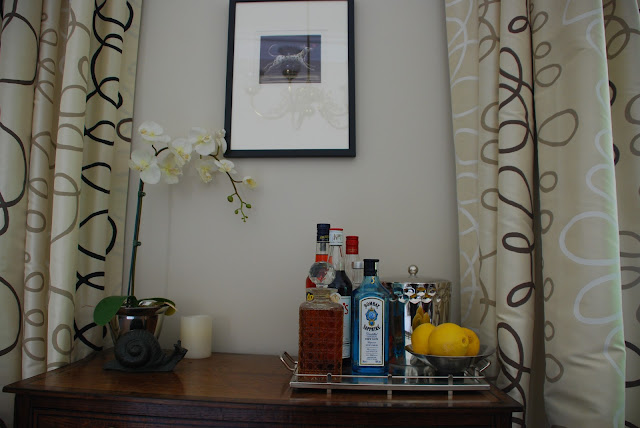
I also, somehow, managed to do this in my house. The Study/Library has an existing marble fireplace that has reddish brown marble with black marble accents. Despite not taking this into consideration when I picked the paint colour and curtain fabric from Melbourne, I ended up choosing colours that co-ordinated perfectly.
I also managed this in our bedroom, where a white/pale grey Marble fireplace co-ordinates perfectly with the silver/grey seagrass wallpaper and the charcoal and cream patterned fabric I chose for our curtains and bedhead.
I think, though, that there are some colours that are harder to remember. Navy is difficult - there are so many various shades. And we all know how difficult it is to pick a white paint colour....a shade off can be a disaster.
At any rate, I try not to get too hung up on perfect matching - our eye is naturally drawn to what occurs in nature, and nature is not perfect. This is why one of the first principles of decorating well, is not to buy everything from the same source/brand - the colours are absolutely perfect matches across the range, which can give an overall dead and lifeless showroom type feel if used in a room together. I'll never forget the effect of walking into a client's flat in London's Mayfair, which had been decorated (under her instruction) completely in Colefax and Fowler papers and fabrics. It felt exactly like a photo shoot for the catalogue. To complete the client's obvious love of matching, we were charged with the task of unifying all the various lampshades to the same type of fabric, so that she didn't have a visual jarring of card v's various shades of creamy white fabric shades, some offensively pleated and others plain. The horror.
So, while I'm obviously not afraid of not matching, I do seem to suffer from matchy-matchy disorder to some extent.....hopefully in just the right way.


