This before and after will not seem to fit together. When I was planning the house out, I decided to take the front formal Drawing/Sitting room for the Master Bedroom, and then knock through a door into a bedroom that was next to it to create a dressing room and ensuite bathroom. We didn't have a need for a lot of formal rooms - we don't entertain like that, so my main mantra has been that we use all the spaces in our house, and not have spare rooms with junk in them, or too many formal rooms that are used 2 or 3 times a year.
So for the before shot, here is the original bedroom from the real estate listing photos:
We removed the chimney in the room (it had a timber mantel) and divided it into two. The new door into our Bedroom is where the wardrobe is in this picture. I like privacy in a bathroom (probably because I rarely get any with three children....), so the dressing room was put on the half that has the window, and the bathroom is in the other half and has a new skylight. The original door from the hallway was bricked over, and a medicine cabinet created in the alcove.
 |
| Same view now, with dividing wall |
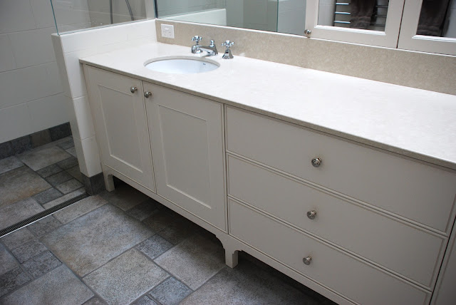
I chose a grey flagstone effect floor tile. I had honed Limestone in our previous bathroom, and it didn't wear terribly well (it stains easily, even from colourless shampoo, and is quite a brittle stone so develops cracks and chips). For this reason, I wanted something durable (it was used in both bathrooms), and as I have a lot of grey tones in the house (the Melbourne influence), this worked well with the carpet and cabinetry in the dressing room. A creamy white wall tile complemented it. All the tiles were from Aeria Country Floors (who have now gone into liquidation, sadly).
The double shower was born out of Mr AV and I fighting over which shower head to buy - we never shower at the same time. He favours the type that drown you with water, I like the ones where I don't get my hair wet. In the end, I decided to get him his, and get one I liked for me too, as we don't plan on moving for the next 20 years. The shower head (drowning one) was Hansgrohe, and the other one is Grohe. The mixers were from Astra Walker, as were the handbasin taps.
Toilet is Duravit. I went to the Mary Noall warehouse sale in Melbourne when my youngest was 2 weeks old (that's how committed I was to the cause), as they had 50% off all the European imports. I bought all the toilets, a bath, kitchen sinks, laundry sink, kitchen tap and then had to work out how to get it to Adelaide.
I'm very into practicality in design (this probably differentiates me from many other Architects who will go more for pure aesthetics), and so I did an upstand on the vanity (so the mirror doesn't meet the vanity) as I hate seeing water spots on mirrors, and any time you use a basin, you'll end up getting some water on the mirror. As a result, the mirrors are almost always perfect.
We have a very large expanse of benchtop. It's in a composite stone (quarella/ caesarstone). You can see the two medicine cabinets in the photo above which are where the old door was to the hallway.
The heated towel rail runs off the hydronic heating system, and is large enough that it dries all the towels hanging on it in Winter. We also have underfloor heating (this is not as expensive as you might think to install if you are doing your bathroom up, so if you're going to put in a new bathroom and it's cold where you are, investigate it).
I wanted the legs of the vanity unit to look more like a cabinet.
Lastly, a skylight (Velux) which opens via remote. Masses of daylight and natural ventilation.
In person, this bathroom is a lot whiter than my fairly poor quality photos. The floor tiles are a softer grey too, but no matter. You get the idea! Having gone from a tiny cottage where we only had one bathroom (with a laundry cupboard in the corner) to having our own space and the children theirs, it feels very luxurious.


