Kitchen Design 2011


In 2011 we will see the kitchen becoming accepted as the defining feature of the surrounding architecture; all inspiring, with the ability to encourage a connection between concrete, steel and the personal attitudes that animate the space on a daily basis!
Architecture is the purest form of art but kitchen design is an understanding of how human nature and personal experiences can paint many different pictures within this architectural frame.
The true value of multi-level kitchen design has only begun to be explored!  The Mogul is sure that there are interesting times ahead and asks; is the modern kitchen now defined by the units that have become integrated into the architecture and cannot be seen?  If the answer is yes the modern kitchen is to become an island or peninsula, an anchor for function and sociability in an open plan setting.
The Mogul wishes everyone a Merry Christmas and a Happy New year and will be back in 2011 to keep a close eye on everything...Oh yea...The Mogul will also have big news about an important new friend!

Ego Kitchen with Cool Taps

This design by Tokyo Kitchen epitomises what modern kitchen designers seek; super cool functional sophistication with a distinct undertone of artistic flair.  Owning this kitchen would offer serious social style gratification and allow you to wallow in the envy of others.  It takes something to impress The Mogul!.....NICE!  Absolutely love the inflatable taps, oversized and egotistical...perfect!

Terminal Velocity


This kitchen strikes your retina at terminal velocity and imposes itself on the simplicity of the surrounding architecture.  The design is simple, linear and arguably unremarkable but the enthusiasm of the olive colour and the intellectual use of a contrasting recessed grip handle makes this kitchen reach out and grab your attention. 

The black handle highlights the fact that this handless kitchen has in-fact got a handle and that the designer has been clever enough to use it as a fantastic feature, highlighting the simplicity of the design.  It is also interesting to see that the designers at Armony Cucine have not been tempted to go symmetrical along the back wall and have opted to off-set the ovens to the right of the tall section. 

The mogul predicts that we will see more of this in 2011; asymmetrical design and vibrant colours!  Particularly orange!

Console Kitchen


This concept kitchen designed by Zivile Januskaityte may seem extreme but it tests the imagination about what the kitchen is now and what it may become in the future!

There are some great ideas here that could be fine tuned and become more main stream in the not too distant future.  For example the induction cooker is actually the rolling ceramic panels that close over the entire kitchen.  This is a great "Shape Shifting" idea but it has its limitations when the surface is also being used as a worktop.

Careful consideration needs to be given to reverse heat transfer.  Reverse heat transfer happens when the substance being cooked becomes very hot and transfers its heat energy back through the pot and onto the ceramic induction cooker!  This process is not an issue with standard induction cooking but it may become one if the cook top is not highly visible, the cook top can move and if there is limited preparation space! 

The Mogul believes that any forward thinking designer should be highly commended, as it is only by exploring new things that we can develop the fantastic kitchen designs of the future!  Top marks here!

Sense of Place


The kitchen is an inspiring room that can provoke feelings of security and safety.  It can be a personal space where memories have been made and intimate conversations have taken place with relatives and friends. 

This can be felt even more strongly at different times of the year and especially during the Christmas holiday season.   The smells and atmosphere of a Christmas dinner can be subconsciously carried by people for years, enhancing the connection with the kitchen and the family members that used it.

Kitchen designers have to shoulder a big responsibility as their creations will become the stage set for personal dramas and reflections over many years, helping to encourage a “Sense of Place”!

The Mogul believes that any design, whether it is a super contemporary European special or something a little more traditional, needs human interaction to make the design complete!  

Sexual Kitchen on Wheels!


Okay, please desist from licking your computer screen as this serving from Aster Cucine is absolutely delicious. 
This kitchen is a brilliant example of how kitchen design can be paralleled to automotive design, providing clients with an exceptionally desirable product that can make a strong social statement! 
This kitchen is beautiful and has all the elements required to nurture envy and jealousy amongst your dinner guests.   The dazzling whiteness is matched by polished and hammered chrome with glass and natural wood veneers that just ooze quality.  You only have to look at the mirrored chrome finish that rips around the edge of the island to see the luxury.  Fantastic!
This beauty is also a shape shifter.  Bi-folding sliding doors on the tall section of this kitchen allow the exterior units to become undressed, allowing the viewer to be tantalised by the impressive appliances and drawers!  Add Blum’s Servo-Drive electric opening support system for doors and drawers and the blured border between living room and kitchen and this design offers the ultimate in sensory gratification!
You can now lick the monitor!!

Sliding Kitchen


Cool sliding doors offering flexibility of use to the owner!

Stone Walled


This kitchen by Steve Morey was voted the best looking kitchen in 2008 by the New York Architectural Digest.  It is a very impressive architectural space and the kitchen does step up to the mark. 
The Mogul absolutely loves the size of the island which gives the kitchen a real presence and matches the scaling of the space.  The thing that really makes this kitchen different though is the dry built stone wall which is framed by a smooth arch!  This feature works brilliantly with the down lighting!

White Kitchen Pod


The Mogul loves white kitchens as they are a welcoming canvas for reflective light and shadows.  This kitchen is brilliant as it is free hung from the wall allowing the plinth to be removed and a shadow line to be created....this shadow void is absolutely crying out for some subtle mood lighting! 
This design also proves that you don’t need acres of wall space to create a brilliant kitchen...why not ignore the walls and place the kitchen in the middle of the room, handy if the architecture is tricky!  

Paper Clip Kitchen


A wonderful example of functional, artistic vision!

Ripple Kitchen


Brilliant...doors that appreciate all three of our worldly dimensions!  Adding a coloured up or down lighter to these doors will create a fantastic feature. 

The Mogul would question the ergonomic planning on the island though!  Obviously the cook is smaller than the dishwasher and they never exchange roles! 

American Contemporary Home Coming


This kitchen embodies the classical contemporary style.  It is a prefect example of how individuals can find balance between a crisp, fresh kitchen design and something that is safer, offering serious style stamina! 

Contemporary European kitchen design can be perceived to be fashionable but without soul making the customer wary about installing a statement kitchen into their home.  Instead they may want to tone down the drama and install a kitchen that offers more universal appeal. 

This idea is particularly prevalent in the United States were full on contemporary kitchen design is kept isolated at the very top of the market, a place were affluent clients can afford to move with shifting design trends!  Middle America is much more cautious, constantly considering what other people will think of their new kitchen, and by other people The Mogul means other house buyers!  America appears to be a transient nation and re-sale value is a big consideration! 

The Mogul absolutely loves this kitchen as it has everything and believes that this type of design is perfect for the cautious American public.  The doors have a simple painted profile that gives the design very classical roots, even the format of the tall units on the back wall lend themselves to a more English classical style but there are many contemporary features here too.  The asymmetrical format of units and open shelves over the cooker, the pocket door system integrated into the larder, the waterfall worktop that hugs the base units and the funky island design all scream trendy kitchen at the viewer.  The island is brilliantly simple providing a cantilevered seating area and an open self complete with a clever sliding door system that conceals all cooking activity from visiting dinner guests. This kitchen also flows seamlessly into the dining area giving great continuity to the architectural space!

This design by Castagna Cucine is a perfect example of how fashionable tastes can be satisfied without alienating potential buyers and it is noticeable that many good American kitchen designers are realizing this and reinventing “safe contemporary” on a daily basis for their appreciative clients!

Quirky Kitchen

Asymmetrical and unconventional kitchen furniture, absolutely brilliant!  Check out the glass table legs!

Simply Unconventional

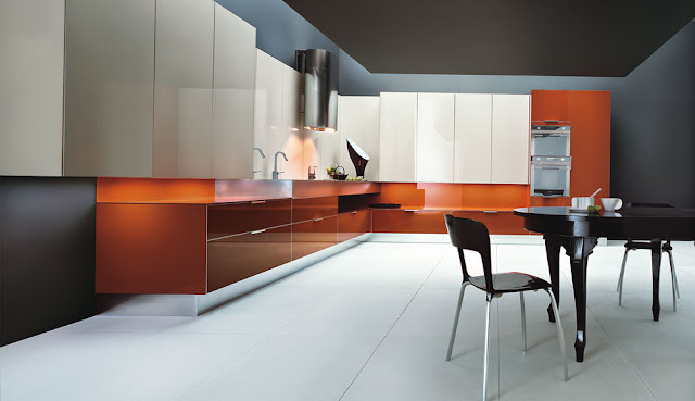
The Mogul loves this kitchen by Cesar as it doesn’t conform to standard kitchen design.  Standard door matrices are thrown out the window to create this look!  Or are they?
The wall units are oversized in order to maximise storage and are carefully positioned so as not to interfere with the worktop.  The kitchen has multiple levels and when matched with the vibrant colours creates an immediate and interesting visual impact for the onlooker.
The oversized glass doors used on the wall units also double up as a very handy splash-back behind the main cooking and cleaning zones giving the impression that the wall units have continued around the wall and become recessed.  The lower level red glass units on the back wall also give this kitchen a living room type feel as the space between them and the underside of the wall units creates a handy shelf/ alcove, perfect if you want to personalise this space!
This kitchen is imaginative and could easily be created using standard sized doors and on a budget so top marks to the designers here for coming at this from left field!

Telescopic Kitchen


This is Moove 02 from Florida Cucine.  Another “Shape Shifter”, or telescopic kitchen design!  

The island consists of two parts allowing the cook top to disappear under the waterfall framed worktop when not in use.  This movement has two benefits, creating space when the kitchen is not being used and presenting guests with an informal seating area when being used.

Let’s hope the floor is level for this one and you remember to turn the gas off!

Book Matched Beauty


This kitchen by Increation illustrates how effective a book matched veneer can be, allowing the beautifully exotic redwood grain to stamp its authority on this design.  It looks brilliant with the high gloss grey and the purple glass splash-back.
Open minded clients have allowed design muscles to be flexed here.  Fantastic!

It's an EMPTY kitchen - but not as we know it!


Modern kitchen designers see themselves as artistic interpreters of function, providing their clients with a product that will harmoniously occupy their lives for many years to come.  Visionary designers see the kitchen as a small, clinical space free from personality or self expression. 

The Mogul believes that the human spirit will always find a way to personalize the space in which it inhabits, so how we make the transition form the homely kitchen of today to the sanitized space of tomorrow will be an interesting road to travel.   The Mogul has booked a ticket for this journey!