One of a Kind Show, Toronto Spring 2011

Wednesday, I popped on over to the One of a Kind Spring show. The Show hosted a little breakfast Wednesday morning that included some bloggers. I chatted with JenEmilija and Lisa at the breakfast, and  browsed the show with Jen as we chit chatted about the Bloggers Give Back, our babies, and of course, decorating.

I picked up a few things at the show  - A bar of lavender scented soap (1), Lavender and Cedar Linen Spray (2) A little wooden car and boat for Oscar (3) and I fell in love with some art (4) and I also brought back some macaroons for Aubrey from Sweet Definition which sadly aren't photographed as we ate them too quickly. ;)
(1) Soaps by Demo Soap (2) Olive Linen Spray $12 by Olive Authentique(3) Thorpe Toys  (4 & 5) Paintings - Pauline Conley (6) Felt Animals by Lesley Anne Green (7) Playmobil Paintings by Studio Liscious

Stonehenge Kitchen

Some of the simplest things in our world have the ability to convey a powerful message, sometimes powerful enough to encourage lifestyle choices. 
Just as some individuals will long for the sun to rise above the monolithic structure of Stonehenge in order to find perspective and direction in their lives, so too will inspiration be found in this clever format of functional shapes.
Forget what you know and imagine what can be!  The kitchen is now a more compact, efficient and purposeful series of units that have the ability to inspire the people who revolve around its artistic epicentre of function. 
The kitchen has also grown up...just like a stroppy teenager, it has detached itself from its architectural and self-righteous parents...the kitchen now stands alone and demands some serious attention.
Kitchen Design is changing!

Fantasy Kitchen

This fantasy set up has a feminine allure; crisp, suggestive and completely practical!  Love it!

Rugs - Size Matters

I got my May 2011 Style at Home issue in the mail yesterday. This issue is packed with a lot of inspiring pictures but what made it even more awesome was on Page 64, I can across this...."Choose the right rug for you."  You all know my search for a Living Room Carpet (which is kind of on hold because of the new, unexpected furnace)

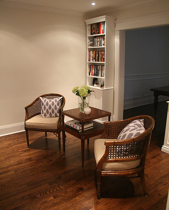
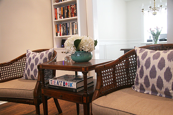
Ever since we invested in that really expensive side table between the chairs, a more defined living space happened. So I wondered if I needed a rug to go as close to the bookshelves as I had originally thought. Maybe it could be shorter? (And thus maybe more easy to find, and less expensive)

New Living Room Table
New, more defined living area because of the addition of the table between chairs


So what great timing to find this little tidbit in Style at Home, as Christine Hanlon give us some really great tips and pretty much answers my question with her second tip on "size"

----------
Use your rug to frame the primary seating arrangement in the room, but remember these rules.
1. An Area Rug should always extend under all of the key furniture pieces.
2. It's best not to have a large section of Empty Rug beyond where the furniture ends; Ideally the rug should only extend one to two feet beyond the furniture - ensure this is consistent on all sides.
----------
So I think I have to still look for a rug that will go close to the bookshelves otherwise it may look like a postage stamp. For now, we will continue to live with our hardwood, which really --- I don't mind.

A B Sea

I was Spring cleaning my Internet Favourites the other day and came across a link to this poster. Isn't it hilariously cute?  Poster by James Mattison, available here.

Kitchen Cantilever


Flaunting a gravity defying cantilever that would have Sir Isaac Newton scratching his head this kitchen makes a design statement.  Matched equally with the shape shifting qualities needed to enable a smooth transition between states of use this design by Key Cucine is great.   
The Mogul loves the functional versatility here and how the asymmetry along the back wall counter balances the cantilever! 
This kitchen has everything; good looks, social space, transformational qualities and even a KitchenAid combination hob for a versatile and controlled cooking experience....Extractor??

Closet Kitchen - The Image

What you were supposed to see!

Closet Kitchen

Imagine that you have never seen or used a kitchen before, imagine that the kitchen design rule book has been thrown out the window and you now have an opportunity to design a kitchen that functions well and looks beautiful.  Would you create something like this?

This design has all the influence of new age kitchen design and illustrates perfectly how the kitchen is now the focal point of our home lives.  The modern kitchen has “come out” of its architectural closet and now enjoys prancing around our home demanding our adoration. 
The modern kitchen is no longer classified as an ineffective series of air filled boxes covering every possible inch of wall space; kitchens are now smaller, detached from the floor, asymmetrically balanced and designed with finesse and artistic flair.  There is now great attention to hidden detail which gives the kitchen confidence to subtly dominate our living space.  
This design is brilliant and The Mogul would be happy with all of the elements seen here being included on page one of the new kitchen design manual.  The question is....where does kitchen design go from here?  The Mogul is not telling you yet!

Floral Arrangements

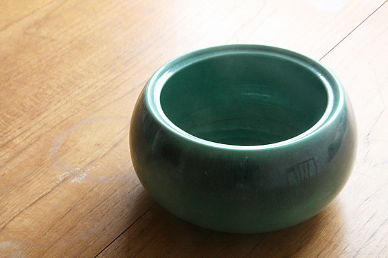
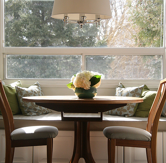
I visited that Antique Shop again and picked up this Royal Haeger bowl for $10. I always love keeping my eye open for things like this for flower arrangements. A low profile bowl like this, I knew would be perfect for some big flowers. I thought that this bowl would be perfect for if we were to host a dinner party. It's a low profile, so you're not going to be blocking anyones view.

002

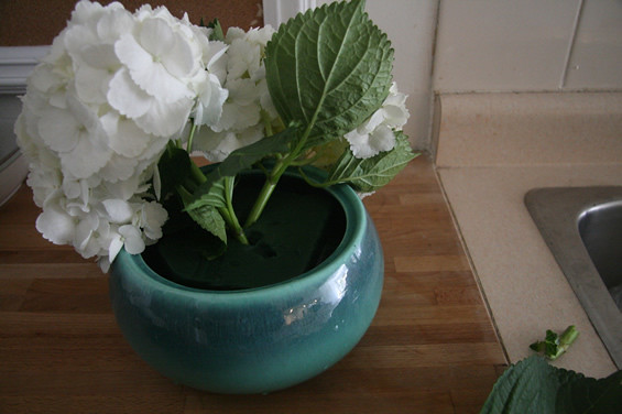
Not wanting to wait for that dinner party to host, I got impatient and decided to pick up some flowers to try out my new purchase. I picked up 3 Hydrangea heads at my local florist at $4.00 a head. 

066

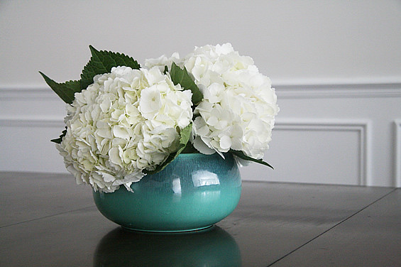
I cut off most of their stem as the vase was super short. I'm not a flower expert but one thing my florist keeps telling me is to cut the end cut on a vertical after I cut them to length, so they drink the water better. He gave me some oasis to try. I must say, it would make a very pretty dinner party arrangement.

095

It also looked good here..

133

But in the end, it went ...

160

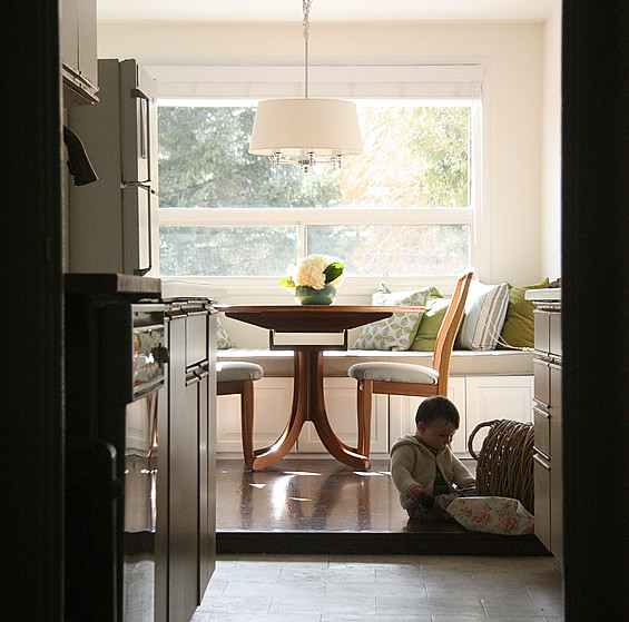
I just loved this scene from today.

149

It's a Kitchen....Man!!


This kitchen is loosely defined; falling into the social space as though it has just been off loaded from a VW Camper with a surf board strapped to the roof.  This design is not bothered about conformity, it manages to function and look cool...what else do you need! 
This concept is fantastically relaxed offering a great blend of steal, stone and wood veneer, but with two ovens the design is prepared for guests but unfortunately the preparation zone isn’t!
Abstract and trendy this kitchen tests our expectations of what a kitchen should be but The Mogul can’t help but get a dentist surgery feeling from the cleaning and cooking zone! 

How things began...

With talk of properly crediting people on blogs, I've always had the Rast Hack in the back of my head. So I am going to clear my conscience and show you. :) Read on.

In September 2008 I tackled a weekend makeover of some drawers. The Rast Hack. As I mentioned in my original post in 2008, it wasn't my idea, I was totally inspired by Style at Home Magazine. Since then, the hack has gone bananas and the original source, Style at Home, gets dropped. Since 2008 I never could find the original picture to show you (I had ripped it out and brought it with me to Lee Valley) Finally, a few weeks ago, I finally sent Lauren a note asking if she could find it. A few days later, she mailed it over to me, with a helpful little post it note on the page.

What I hadn't rememebered was that the hack was actually done by none other than Tamara Robbins Griffith.  Thanks to Lauren I can finally show you how this beauty started. Although I've always credited Style at Home Magazine I think a shout out to Tamara is in order....three years later. ;) I feel better finally being able to show you the image of where the IKEA Rast hack started.  Like a weight has been lifted off my shoulders. Now go and makeover a Rast of your own.

Next to my own,  my favorite makeover is by Caroline here. I think it is so bright and cheerful. LOVE.

Mood Board Using Ikea + Tonic Living

You may recall that not that long ago I posted about a charity initiative called Bloggers Give Back. (Which has since gotten its own website http://www.bloggersgiveback.com/) Two companies, Tonic Living and IKEA were among the first to get on board (see other sponsors on our site!).

Yard

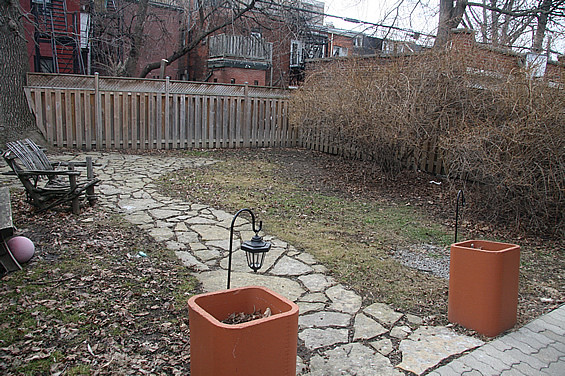
So our Blog Crew got homework - we all had to come up with our own individual mood boards of the garden using IKEA and Tonic Living outdoor fabric. And, this Thursday we're all going to vote on our favourite over on the BloggersGiveBack site. I'm not going to lie, at first it was daunting but then I went a little crazy. Don't judge, I love graphics.

So here is my mood board. I incorporated privacy screens like DIY ones we made in our yard. I picture them in this yard to create some different "spaces" among the large space and some needed architectural interest. So, for this purpose I simply divided the yard into 2 distinct areas. The Lounge Area, and the Dining.  I also took out the grass in my look because the house asked for "low maintenance", and replaced it with stone walkways and beds of lavender and tall grasses.

1. Privacy Screens much like these 2. ARHOLMA Couch (Isn't it gorgeous!?) 3. ARHOLMA ArmChair  4. ARHOLMA Coffee Table (But could be extra seating) 5. Tonic Livings "Outdoor - Slick, Mink" used as accent cushions throughout  6. I lost the 6 circle somewhere, I think a groundhog ran off with it 7. HASSELÖN Table 8. Tarno Folding Chairs x 6  (Easy to store during the winter months)

Any ideas on what you think would make a good yard for a group of women? What do you think we should incorporate. I'm really looking for suggestions on how you think we could make this yard into a great space for the house.

A special thanks to the Sponsors of the Bloggers Give Back IKEA and Tonic Living. If you would like to donate or give product for the makeover shoot me an e-mail at aubreyandlindsay@hotmail.com

The Kitchen is Not Enough!

The Mogul is guessing that the ceiling has just separated to allow the fashionable, boxed extraction system to descend!!
Is this the perfect kitchen, for the perfect concrete bunker, for the perfect James Bond villain?
Fantastic!

Baby Post: Introducing Baby Shoes

Oscar was given a pair of See Kai Run shoes awhile ago and I had to post this photo. The retro stripes on the shoes, the fake laces, and well, combined with the plaid pants that are hand me downs from my good friend this picture just makes me giggle. (He's in the "Smaller" line of shoes still because he's so young) Honestly, little baby shoes melt my heart.

 
As Oscar is learning to walk (he is determined to always be standing) we're right now battling the issue of hardwood + socks = slipping. What did you Mamas do if you had hardwood? Make them go sockless or do you put shoes on them?

Fulton Sales is going to be hosting a giveaway of these shoes over the their Facebook page later on today so head on over. 
xo Lindsay

The Holy Grail of Kitchens


This is a melting pot of ideas and materials that works fantastically well giving the design an edgy feel without striking fear into those who are looking for a more traditional style! 
The skeletal metal framework gives this kitchen a modular and progressive appearance while the use of natural wood veneers provides a welcoming reassurance; softening the overall look in order to make it more mainstream palatable.  Free hanging units, skewed symmetry and cleverly integrated holistic lighting provides visual stimulation for the viewer while the island provides a merry mix of function and sociability.
The Mogul feels that this design by Bazzeo is a real hybrid, attempting to give clients the holy grail of kitchen solutions; the perfect ultra-contemporary kitchen that is completely traditional and totally ageless.  Enjoy!

The Kitchen Table


The kitchen has become detached, removed from the historical rock unto which it has always clung.  The surrounding architecture creates space, defines scale and perspective but the modern kitchen appears to no longer need these architectural manacles! 
The mogul even begins to question the future existence of the kitchen as we recognise it today.  The kitchen is becoming an island and that island is becoming a table!  Is there the distinct possibility that in the future functionality will be preceded by sociability, or that the two elements will fuse that closely with technology that the kitchen table will facilitate all our needs!!
This may all sound like fantasy but look at some of these images including the N1 robot table and see if you can see into the future!!

It was too fancy

Remember I framed a beautiful photo of the sea for the new basement bathroom? Although it looked gorgeous (I do admit that),  It really wasn't right for our bathroom. It was much too "fancy". Aubrey said it felt like a "Hotel" Bathroom. Which is a compliment, and a great look. But is the bathroom of my workspace/studio where I create fun, cute things. So it just didn't work for this particular space. So I took it down. And I was doing a photo shoot of one of my new prints and I placed it here....

I love this print. It cracks me up. (It says "Oscar is Kind of a Big Deal around here")  I'm getting closer to something I want for in here. But I don't think this is the right print for the washroom. But it's close.

Update...it's kind of growing on me. I may keep it up!

Backdrop Kitchen


The kitchen has truly become the backdrop to our home lives!  A functionally adaptable and socially welcoming space!

Sheltered from the elements

This image is striking showing us a vision of the future while reminding us of the past.  The kitchen sits within a frame of decaying architecture, a frame showing the impact of time and human activity.  
The wall units of this kitchen appear to caress and shelter the base units, protecting their beauty from the ravages of the worn surroundings.   The smooth, gloss finishes incorporated into the design contrast strongly with the worktops amplifying the overall appearance of this kitchen.  However the strongest feature is the asymmetrical and unbalanced nature of the design which is given even more presence through the use of a strong linear door matrix.
Enter the rustic timber tables and the juxtaposition of this design and image is complete!  

Gorenje Get It

Kitchen pods and dreams!  The Mogul loves this!!

Party Kitchen

There is something not right here...you just can’t put your finger on it!  Don’t misunderstand The Mogul as it could be just a personal preference, but those fantastically muscular appliances along the back wall don’t sit well within this streamlined contemporary design!  Both the kitchen design and the appliances are great...but just not together!
The overall look is impressive, incorporating some cutting edge asymmetrical design theories and multi-unit levels to add interest and increase functional capacity.  The lower area in the foreground provides a casual landing area for your guests to crash and nibble but The Mogul must again question the appeal of this informal seating area!  Cold, hard surfaces may not appear all that inviting to “crashing guests”, lack of back support may also mean that this would be a “short sit”! The area is probably too low for preparation but would work well as an informal, integrated coffee table, ideal for canapés and champagne!!
Lets empty that wine cellar because this is a party kitchen!

OshKosh B'Gosh!

I find that there really isn't a lot of great cute clothing gor boys, as there are for girls, but when you find something cute - it looks  REALLY cute on a little guy. Like boy ties, ties, and overalls. How cute are these OshKosh B'Gosh Overalls that my Mom bought him? Hilarious.

Check it out --- we have a website for our "Bloggers Give Back" project. We have some AMAZING supporters (Ikea, Bona Vista, and Tonic Living) an amazing private donation of $500, and a page that shows you the bloggers taking part with their photos. (More being added...) If you'd like to take part, let me know!

Integration

Are those ovens in the living room?

Functional Kitchen

The Mogul loves how the ovens have been left sitting on the worktop as though the fitting team has removed them from the packaging and forgotten to actually fit them.
The design looks brilliant but you have to question the amount of preparation space available within this design.  Remember; function is the foundation for kitchen design and there appears to be an intimate relationship developing between the cleaning and cooking zones here with a limited amount of space available to the right hand side of the hob. 
It could also be argued that the absent minded fitter should have placed the ovens closer to the end of the worktop giving the end user more, unbroken preparation space.  However, The Mogul would concede that by doing this the design would become less aesthetically appealing, so top marks to that aesthetically astute fitter!!  The end user might eat out a lot!
However this design does consider function as the designers have used a Blum Syncromotion Corner Drawer to utilise the full depth of the corner unit. 
Are commercially driven aesthetics now taking precedence over function?  The Mogul will let you be the judge!

Sweet Nothings Kitchen


A few words spoken softly can be more powerful than shouting in anger!  Contemporary kitchen design has the ability to whisper softly enough to be heard on many levels. 
This kitchen agrees with the architecture and the quiet murmurings between the disciplines project a powerful statement of style.
It is always said that the quiet party within any conversation is controlling it...maybe you are unusually quiet because your jaw is scraping against the floor in total awe of what you see!
Kitchen design is changing!!